Opacity
LookAway

Solution:
<div></div>
<h1></h1>
<h1 a></h1>
<h2></h2>
<style>
  body {
    background: #131313;
  }
  div {
    width: 240px;
    height: 190px;
    background: radial-gradient(
        circle at 20px 105px,
        #f459e3 150px,
        transparent 100px
      ), radial-gradient(1Q at 70px 110px, #e89a52 140px, #f9c96c 100px);
    margin: 55 auto;
    rotate: -15deg;
    border-radius: 65px 65px 120px 120px;
  }
  h1 {
    width: 50px;
    height: 50px;
    border-radius: 50%;
    margin: -180 92;
    position: relative;
    border: solid 15px #131313;
    clip-path: polygon(0 50%, 100% 50%, 100% 100%, 0 100%);
  }
  [a] {
    margin: 100 187;
  }
  h2 {
    width: 15px;
    height: 15px;
    border-radius: 50%;
    background: #131313;
    position: relative;
    margin: -148 92;
    color: #131313;
    box-shadow: 65px 0, 95px 0, 160px 0;
  }
</style>
Minified:
<p><h1><h1 a><h2><style>*{background:#131313;color:131313;position:relative;border-radius:50%}p{width:240;height:190;background:radial-gradient(1q at 21q 111q,#F459E3 50vh,#0000 25vw),radial-gradient(1q at 70px 110px,#E89A52 35vw,#F9C96C 25vw);margin:55 72;rotate:-15deg;border-radius:69q 69q 30vw 30vw}[a]{margin:100 187}h2{width:15;height:15;margin:-148 92;box-shadow:69q 0,95px 0,40vw 0}h1{width:50;height:50;background:0;margin:-180 92;border:solid 16q;clip-path:polygon(0 50%,100%50%,100%100%,0 100%
Tree
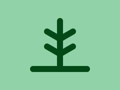
Solution:
<div></div>
<div a></div>
<div b></div>
<div b c></div>
<style>
  body {
    background: #90d3a6;
  }
  div {
    width: 200px;
    height: 20px;
    border-radius: 10px;
    background: #024817;
    margin: 220 auto;
  }
  [a] {
    width: 180px;
    margin: -320 auto;
    rotate: 90deg;
  }
  [b] {
    width: 60px;
    margin: 265 137;
    rotate: 30deg;
    box-shadow: 25px 44px #024817;
  }
  [c] {
    rotate: -30deg;
    margin: -286 190;
    box-shadow: -25px 44px #024817;
  }
</style>
Minified:
<p><p a><p b><p b c><style>*{background:#90D3A6;color:024817}p{width:200;height:20;border-radius:10px;background:#024817;margin:220 92}[a]{width:180;margin:-320 102;rotate:90deg}[b]{width:60;margin:265 137;rotate:30deg;box-shadow:25px 44px}[c]{rotate:-30deg;margin:-286 190;box-shadow:-25px 44px
Crystal
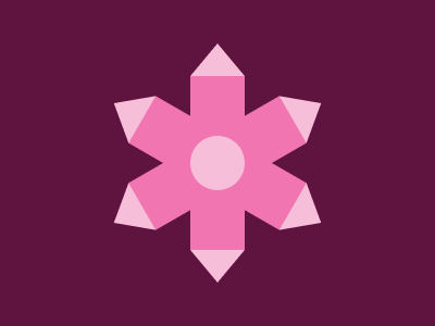
Solution:
<div></div>
<div a></div>
<div b></div>
<style>
  body {
    background: #5f133f;
  }
  div {
    width: 50px;
    height: 220px;
    position: fixed;
    top: 40;
    left: 175;
    background: linear-gradient(
        #f7bed9 30px,
        transparent 30px 190px,
        #f7bed9 190px
      ), radial-gradient(circle at center, #f7bed9 25px, #f075b0 25px);
    clip-path: polygon(50% 0, 100% 30px, 100% 190px, 50% 100%, 0 190px, 0 30px);
  }
  [a] {
    rotate: 60deg;
  }
  [b] {
    rotate: -60deg;
  }
</style>
Minified:
<p><p a><p a b><style>*{background:#5F133F}[a]{rotate:60deg}[b]{rotate:-60deg}p{width:50;height:220;position:fixed;top:24.5;left:175;background:linear-gradient(#F7BED9 32q,#0000 0 200q,#F7BED9 0),radial-gradient(1q,#F7BED9 27q,#F075B0 0);clip-path:polygon(50%0,100%32q,100%200q,50%100%,0 200q,0 32q
Walls
Solution:
<div></div>
<h1></h1>
<style>
  body {
    background: #6867d4;
  }
  div {
    width: 50px;
    height: 100px;
    background: #7bafde;
    transform: skew(0, 27deg);
    margin: 112 -8;
    box-shadow: 175px -127px 0 25px#7BAFDE, 175px -76px 0 25px#7BAFDE,
      350px -203px #7bafde;
  }
  h1 {
    width: 100px;
    height: 100px;
    background: #000039;
    transform: skew(0, -27deg);
    margin: -224 42;
    box-shadow: 200px 102px #000039;
  }
</style>
Minified:
<body bgcolor=6867D4 text=7BAFDE><p><p a><style>[a]{width:100;background:#000039;scale:1-1;margin:-224+42;box-shadow:50vw -108q#000039}p{width:50;height:100;background:#7BAFDE;margin:112-8;box-shadow:175px -127px 0 25px,175px -76px 0 25px,350px -203px;transform:skewY(27deg
Antenna
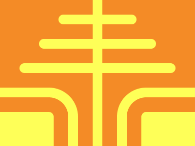
Solution:
<div></div>
<h1></h1>
<h1 a></h1>
<h2></h2>
<style>
  body {
    background: linear-gradient(
      to left,
      #f48b26 190px,
      #feff58 190px,
      #feff58 210px,
      #f48b26 210px
    );
  }
  div {
    width: 150px;
    height: 150px;
    background: #feff58;
    border-radius: 10px;
    margin: 230px -48px;
    box-shadow: 330px 0 #feff58;
  }
  h1 {
    width: 200px;
    height: 200px;
    border-radius: 60px;
    border: solid 20px #feff58;
    margin: -430 -88;
  }
  [a] {
    margin: 190 232;
  }
  h2 {
    width: 160px;
    height: 20px;
    background: #feff58;
    margin: -580 auto;
    border-radius: 20px;
    box-shadow: -40px 50px #feff58, 40px 50px #feff58, -80px 100px #feff58, 80px
        100px #feff58;
  }
</style>
Minified:
<p><h1><h1 a><h2><style>p{width:150;height:150;background:#FEFF58;border-radius: 11q;margin:230-48;box-shadow:349q 0}h1{width:200;height:200;border-radius:63q;border:solid 20px;margin:-430-88}[a]{margin:190+232}h2{width:160;height:20;background:#FEFF58;margin:-580 112;border-radius:21q;box-shadow:-42q 53q,42q 53q,-85q 25vw,85q 25vw}&{color:FEFF58;background:linear-gradient(90deg,#F48B26 201q,#FEFF58 0 222q,#F48B26 0
Lantern
Solution:
<div></div>
<div a></div>
<style>
  body {
    background: linear-gradient(
      to left,
      #fad3e5 175px,
      #8b0051 175px,
      #8b0051 225px,
      #fad3e5 225px
    );
  }
  div {
    width: 250px;
    height: 125px;
    background: #8b0051;
    margin: 27.5 auto;
    clip-path: polygon(50% 0, 100% 50%, 50% 100%, 0 50%);
  }
  [a] {
    margin: -32.5 auto;
  }
</style>
Minified:
<p><p a><p a><style>&{background:#FAD3E5}p{width:50;height:300;background:#8B0051;margin:-8+167}[a]{width:250;height:125;margin:-273+67+268;clip-path:polygon(50%0,100%50%,50%100%,0%50%
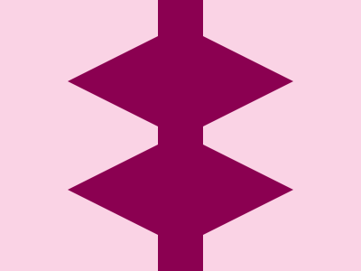
Triple Zero
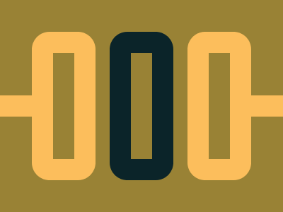
Solution:
<div></div>
<div a></div>
<div b></div>
<h1></h1>
<style>
  body {
    background: #998235;
  }
  div {
    width: 30px;
    height: 150px;
    color: #fcbe5c;
    border: solid 30px;
    border-radius: 25px;
    margin: 45 37;
  }
  [a] {
    margin: -255 147;
    color: #0b2429;
  }
  [b] {
    margin: 45 257;
  }
  h1 {
    width: 50px;
    height: 30px;
    background: #fcbe5c;
    margin: -165 -8;
    box-shadow: 350px 0 #fcbe5c;
  }
</style>
Minified:
<body bgcolor=998235 text=FCBE5C><p><p a><p b><h1><style>p{width:30;height:150;border:solid+32q;border-radius:27q;margin:45+37}[a]{margin:-255+147;color:0B2429}[b]{margin:45+257}h1{width:50;height:30;margin:-165-58;box-shadow:50q+0,425q+0
Steering Wheel
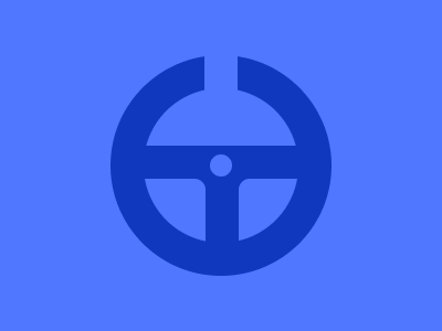
Solution:
<div></div>
<h1></h1>
<style>
  body {
    background: #4f77ff;
  }
  div {
    width: 140px;
    height: 140px;
    background: radial-gradient(circle at center, #4f77ff 10px, #1038bf 10px);
    border-radius: 50%;
    border: solid 30px #1038bf;
    margin: 50 auto;
    position: relative;
    overflow: hidden;
  }
  div::after {
    position: absolute;
    content: "";
    width: 150px;
    height: 70px;
    background: #4f77ff;
    bottom: -12;
    left: -94;
    border-radius: 10px;
    box-shadow: 180px 0 #4f77ff, 90px -100px #4f77ff;
  }
  h1 {
    width: 30px;
    height: 40px;
    background: #4f77ff;
    margin: -250 auto;
    position: relative;
  }
</style>
Minified:
<p><h1><style>*{background:#4F77FF;color:4F77FF;position:relative}p:after{position:absolute;content:"";width:150;height:70;bottom:-12;left:-274;border-radius:10px;box-shadow:60vh 0,90vw 0,90vh -25vw}h1{width:30;height:40;margin:-250+177}p{width:140;height:140;border-radius:50%;border:solid+32q#1038BF;margin:50+92;position:relative;overflow:hidden;background:radial-gradient(1q,#4F77FF+10px,#1038BF