Offset
Simply Circle
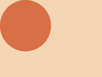
Solution:
<style>
  body {
    background: radial-gradient(
      circle at 100px 100px,
      #d86f45 100px,
      #f5d6b4 100px
    );
  }
</style>
Minified:
<style>body{background:radial-gradient(1q,#D86F45 25vw,#F5D6B4 0)
Long Heart
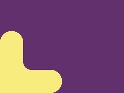
Solution:
<div></div>
<p></p>
<h1></h1>
<style>
  body {
    background: #62306d;
  }
  div {
    position: absolute;
    width: 200px;
    height: 75px;
    background: #f7ec7d;
    bottom: 0;
    left: 0;
    border-radius: 0 37px 37px 0;
    box-shadow: -40px -20px 0 0 #f7ec7d;
  }
  p {
    position: absolute;
    width: 75px;
    height: 180px;
    background: #f7ec7d;
    bottom: 4;
    left: 0;
    border-radius: 37px 37px 0 0;
  }
  h1 {
    position: absolute;
    width: 100px;
    height: 100px;
    background: #62306d;
    bottom: 55px;
    left: 75px;
    border-radius: 0 0 0 20px;
  }
</style>
Minified:
<body bgcolor=62306D><p><p a><h1><style>p{width:75;height:200;background:#F7EC7D;border-radius:6ch 6ch 0 0;margin:100-8}[a]{rotate:90deg;margin:-237.5 54.5}h1{width:75;height:75;margin:25 67;border-radius:27q;box-shadow:-2ch 2ch#F7EC7D
Spotlight
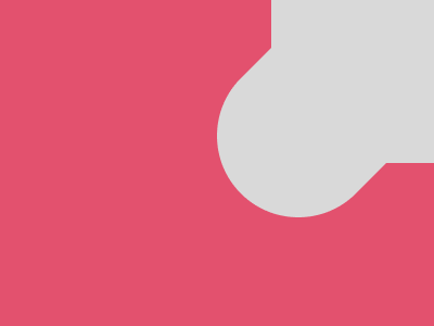
Solution:
<div></div>
<p></p>
<style>
  body {
    background: #e3516e;
    margin: 0;
  }
  div {
    width: 150px;
    height: 150px;
    background: #d9d9d9;
    margin-left: 250px;
  }
  p {
    width: 200px;
    height: 150px;
    position: fixed;
    background: #d9d9d9;
    border-radius: 75px;
    transform: rotate(-45deg);
    top: 17;
    left: 193px;
  }
</style>
Minified:
<body bgcolor=E3516E><p><p a><style>p{width:200;height:150;background:#D9D9D9;margin:-8 242}[a]{border-radius:9ch;rotate:-45deg;margin:-118 185
Streaks

Solution:
<style>
  body {
    background: linear-gradient(
      135deg,
      #998235 345px,
      #fcbe5c 345px,
      #fcbe5c 370px,
      #0b2429 370px,
      #0b2429 395px,
      #998235 395px,
      #998235 420px,
      #fcbe5c 420px,
      #fcbe5c 445px,
      #0b2429 445px,
      #0b2429 470px,
      #998235 470px
    );
  }
</style>
Minified:
<body bgcolor=998235><p><style>p{background:#FCBE5C;height:25;width:400;rotate:-45deg;color:0B2429;box-shadow:0 26q,0 80q#FCBE5C,0 25vw;margin:165 120
Splash

Solution:
<div></div>
<style>
  body {
    background: #6592cf;
  }
  div {
    width: 30px;
    height: 200px;
    background: #060f55;
    border-radius: 20px;
    transform: rotate(-45deg);
    margin: 225px 317px;
    box-shadow: 120px 0 0 0 #060f55, 60px -65px 0 10px #060f55;
  }
</style>
Minified:
<body bgcolor=6592CF><p><style>p{width:30;height:200;background:#060F55;color:060F55;border-radius:2ch;rotate:-45deg;margin:225 317;box-shadow:30vw 0,64q -70q 0 11q
Eight

Solution:
<style>
  body {
    background: radial-gradient(
        circle at 300px 0,
        #926927 50px,
        #6d480a 50px,
        #6d480a 90px,
        transparent 90px
      ), radial-gradient(
        circle at 400px 100px,
        #926927 50px,
        #6d480a 50px,
        #6d480a 90px,
        transparent 90px
      ), radial-gradient(circle at 400px 0, #6d480a 15px, #926927 0);
  }
</style>
Minified:
<body bgcolor=926927><p><p a><style>p{width:25vw;height:25vw;color:6D480A;border:solid 5ch;border-radius:50%;margin:-98 202}[a]{margin:18 302;box-shadow:5ch -25vw
Earthworm
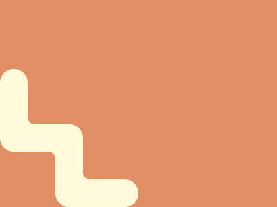
Solution:
<div></div>
<h1></h1>
<h2></h2>
<h3></h3>
<p></p>
<style>
  body {
    margin: 0;
    background: #e38f66;
  }
  div {
    width: 40px;
    height: 120px;
    background: #fffbda;
    margin-top: 100px;
    border-radius: 20px 20px 0 20px;
    box-shadow: 80px 80px 0 0 #fffbda;
  }
  p {
    width: 120px;
    height: 40px;
    background: #fffbda;
    margin-top: -40px;
    border-radius: 20px;
    box-shadow: 80px 80px 0 0 #fffbda;
  }
  h1,
  h2,
  h3 {
    width: 40px;
    height: 40px;
    position: fixed;
    background: #e38f66;
    border-radius: 0 10px;
    left: 40;
  }
  h1 {
    bottom: 18.5px;
    box-shadow: 10px -1px 0 0 #fffbda;
  }
  h2 {
    bottom: 100px;
    box-shadow: -10px 1px 0 0 #fffbda;
  }
  h3 {
    bottom: 21.5px;
    left: 120px;
    box-shadow: -10px 1px 0 0 #fffbda;
  }
</style>
Minified:
<p><p a><h1><style>*{background:#E38F66;color:FFFBDA}p{width:40;height:120;background:#FFFBDA;margin:100-8;border-radius:22q;box-shadow:5em 5em}[a]{rotate:90deg;margin:-47%32;
box-shadow:5em -5em}h1{width:20;height:20;border-radius:50%;margin:80 32;box-shadow:-9q 9q,20q 63q#E38F66,30q 52q,85q 85q#E38F66,70q 90q
Finger Heart

Solution:
<div></div>
<style>
  body {
    background: #4f77ff;
    margin: 0;
  }
  div {
    width: 150px;
    height: 150px;
    background: #1038bf;
    position: relative;
  }
  div::before,
  div::after {
    position: absolute;
    content: " ";
    background: #1038bf;
    width: 50px;
    height: 50px;
    border-radius: 0 0 50px 50px;
    top: 100%;
    right: 0;
  }
  div::after {
    top: 100px;
    left: 100%;
    transform: rotate(-90deg);
  }
</style>
Minified:
<body bgcolor=4F77FF><p><p a><p a b><style>p{width:150;height:150;background:#1038BF;margin:-8}[a]{width:50;height:70;border-radius:7ch;margin:-20 92}[b]{margin:-110 132;rotate:90deg