Grid
Spiral
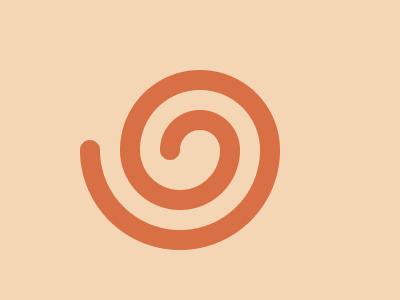
Solution:
<div></div>
<p></p>
<style>
  body {
    background: radial-gradient(
        circle at 90px 150px,
        #d86f45 10px,
        transparent 10px
      ), radial-gradient(circle at 170px 150px, #d86f45 10px, #f5d6b4 10px);
  }
  div {
    width: 160px;
    height: 80px;
    background: radial-gradient(
      circle at 50% 100%,
      #f5d6b4 20px,
      #d86f45 20px,
      #d86f45 40px,
      #f5d6b4 40px,
      #f5d6b4 60px,
      #d86f45 60px
    );
    border-radius: 110px 110px 0 0;
    margin: 70px auto;
  }
  p {
    width: 200px;
    height: 100px;
    background: red;
    margin: -70px 72px;
    border-radius: 0 0 100px 100px;
    background: radial-gradient(
      circle at 50% 0%,
      transparent 40px,
      #d86f45 40px,
      #d86f45 60px,
      #f5d6b4 60px,
      #f5d6b4 80px,
      #d86f45 80px
    );
  }
</style>
Minified:
TBD
Wig
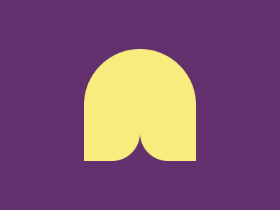
Solution:
<div></div>
<p></p>
<style>
  body {
    background: #62306d;
    display: flex;
    align-items: center;
    justify-content: center;
  }
  div,
  p {
    width: 80px;
    height: 160px;
    background: #f7ec7d;
    border-radius: 80px 0 40px 0;
  }
  p {
    border-radius: 0 80px 0 40px;
  }
</style>
Minified:
<body bgcolor=62306D><p><p a><style>p{width:80;height:160;background:#F7EC7D;border-radius:5em 0 5ch;margin:70 112}[a]{scale:-1 1;margin:-230 192
Spikes
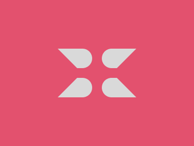
Solution:
<div></div>
<p></p>
<style>
  body {
    background: #e3516e;
  }
  div {
    width: 90px;
    height: 40px;
    border-radius: 50px;
    background: #d9d9d9;
    margin: 100px 0 0 92px;
    box-shadow: 110px 0 0 0 #d9d9d9, 0 60px 0 0 #d9d9d9, 110px 60px 0 0 #d9d9d9;
  }
  p {
    width: 100px;
    height: 100px;
    background: #e3516e;
    transform: rotate(45deg);
    margin-top: -40px;
    margin-left: 40.5px;
    box-shadow: 143.5px -143.5px 0 0 #e3516e;
  }
</style>
Minified:
<body bgcolor=E3516E text=D9D9D9><p><h1><style>p{width:90;height:40;border-radius:3ch;background:#D9D9D9;margin:26%0 0 92;box-shadow:116q 0,0 64q,116q 64q}h1{width:100;height:100;background:#E3516E;rotate:45deg;margin:-40 40;box-shadow:9ch -9ch#E3516E
Alien Eye

Solution:
<div></div>
<style>
  body {
    display: grid;
    place-items: center;
    background: radial-gradient(circle at center, #fcbe5c 90px, #998235 90px);
  }
  div {
    width: 60px;
    height: 60px;
    border-radius: 50%;
    background: #998235;
    margin-left: 20px;
    box-shadow: -10px 0 0 20px #fcbe5c, 0px 0 0 40px #0b2429;
  }
</style>
Minified:
<p><style>body{background:radial-gradient(circle,#FCBE5C 90px,#998235 0)}
p{width:60;height:60;border-radius:50%;margin:120 172;background:#998235;box-shadow:-10px 0 0 20px#FCBE5C,0 0 0 40px#0B2429
Elbow

Solution:
<div></div>
<style>
  body {
    background: #6592cf;
  }
  div {
    width: 250px;
    height: 150px;
    border: solid 50px #060f55;
    border-radius: 100px 0 0;
    margin: 50 42;
    border-right: none;
    border-bottom: none;
  }
</style>
Minified:
<body bgcolor=6592CF><p><style>p{width:250;height:150;border:solid 53q#060F55;border-radius:25vw 0;margin:50 42;border-right:0;border-bottom:0
Lotus

Solution:
<div></div>
<style>
  body {
    background: #926927;
  }
  div,
  div::before,
  div::after {
    width: 100px;
    height: 100px;
    background: #6d480a;
    border-radius: 250px 0px;
    position: relative;
    top: 112;
    left: 192;
  }
  div::before,
  div::after {
    content: "";
    position: absolute;
    top: 0;
    left: -100;
    transform: rotate(90deg);
  }
  div::after {
    top: -20;
    left: -50;
    background: #ffffff;
    transform: rotate(-45deg);
  }
</style>
Minified:
<body bgcolor=926927><p><p a><p b><style>p{width:100;height:100;background:#6D480A;border-radius:250px 0;margin: 120 192 0}p[a]{rotate:-90deg;margin:-100 92}p[b]{rotate:135deg;margin:-120 142;background:#fff
Lamp
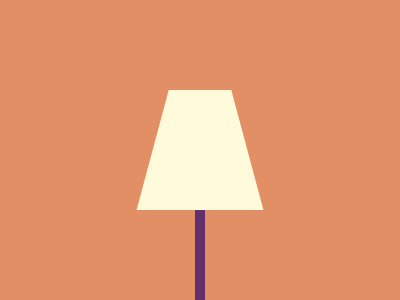
Solution:
<div></div>
<style>
  body {
    background: #e38f66;
  }
  div {
    width: 125px;
    height: 210px;
    margin: 90px auto;
    background: linear-gradient(to bottom, #fffbda 120px, #62306d 0);
    clip-path: polygon(
      31px 0px,
      94px 0px,
      126px 120px,
      67.5px 120px,
      67.5px 210px,
      57.5px 210px,
      57.5px 120px,
      0px 120px
    );
  }
</style>
Minified:
<body bgcolor=E38F66><p><style>p{width:125;height:210;margin:90 129;background:linear-gradient(#FFFBDA 30vw,#62306D 0);cslip-path:polygon(32px 0,94px 0,126px 30vw,67.5px 30vw,67.5px 100%,57.5px 100%,57.5px 30vw,0 30vw
Eclipse

Solution:
<div></div>
<style>
  body {
    background: radial-gradient(
        circle at 50% 130px,
        #4f77ff 40px,
        transparent 0
      ), radial-gradient(circle at 50% 90px, #ffffff 40px, #4f77ff 0);
  }
  div {
    width: 250px;
    height: 250px;
    background: #1038bf;
    transform: rotate(45deg);
    margin: 190 auto 0;
  }
</style>
Minified:
<body bgcolor=4F77FF><p><h1><style>p{width:80;height:80;border-radius:50%;margin:90 152;box-shadow:0 -5ch#fff}h1{height:250;background:#1038BF;rotate:45deg;margin:-70 0