Hover
Arineo

Solution:
<style>
  body {
    background: radial-gradient(
        circle at center,
        #0088ca 11px,
        transparent 10px
      ), linear-gradient(
        #fff 60px,
        transparent 60px,
        transparent 240px,
        #fff 240px
      ), linear-gradient(
        115deg,
        #fff 185px,
        #2e2926 185px,
        #2e2926 225px,
        transparent 225px
      ), linear-gradient(-115deg, #fff 185px, #2e2926 100px, #2e2926 225px, #fff
          225px);
  }
  body::before,
  body::after {
    position: fixed;
    content: "";
    width: 142px;
    height: 20px;
    background: linear-gradient(45deg, #ffffff 20px, #0088ca 10px);
    border: solid 8px #fff;
    top: 92px;
    left: 114px;
    transform: rotate(45deg);
    transform-origin: 0 0;
  }
  body::after {
    border-left: none;
    width: 179px;
    top: 184px;
    left: 194px;
    transform: rotate(-45deg);
    background: linear-gradient(-45deg, #ffffff 20px, #0088ca 10px);
  }
</style>
Minified:
TBD
Donkey Kong

Solution:
<p></p>
<style>
  body {
    background: #000000;
  }
  p {
    width: 300px;
    height: 20px;
    background: #af067c;
    margin: 90 auto;
    border-radius: 10px;
    box-shadow: 0 100px 0 0 #af067c;
  }
  p::before {
    position: fixed;
    content: "";
    width: 300px;
    height: 20px;
    background: #af067c;
    border-radius: 10px;
    top: 140;
    transform: rotate(-4deg);
  }
  p::after {
    position: fixed;
    content: "";
    width: 20px;
    height: 50px;
    background: #ffffff;
    top: 110px;
    left: 80px;
    box-shadow: 110px 40px 0 0 #ffffff, 220px -10px 0 0 #ffffff,
      220px 40px 0 0 #ffffff;
    z-index: -1;
  }
</style>
Minified:
<body bgcolor=0><p><p a><p><h1><style>p{width:300;height:20;background:#AF067C;margin:90 42 -60;border-radius:10px}p[a]{rotate:-4deg}h1{position:fixed;width:20;height:50;background:#FFF;top:85;left:80;box-shadow:110px 3ch#FFF,55vw -10px#FFF,55vw 40px#FFF;z-index:-1
Pacman
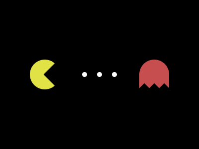
Solution:
<div></div>
<style>
  body {
    background: radial-gradient(circle at center, #fff 5px, transparent 0),
      radial-gradient(circle at 170px 50%, #fff 5px, transparent 0),
      radial-gradient(circle at 230px 50%, #fff 5px, transparent 0),
      radial-gradient(circle at 90px 50%, #e0e246 30px, #000000 0);
  }
  div {
    width: 60px;
    height: 60px;
    background: #c74e4e;
    margin: 120px 272px;
    border-radius: 50% 50% 0 0;
  }
  div::before {
    content: "";
    position: absolute;
    width: 50px;
    height: 50px;
    background: #000;
    transform: translate(-182px, 5px) rotate(45deg);
    box-shadow: 155px -81px 0 0 #000, 170px -95px 0 0 #000,
      183px -108px 0 0 #000;
  }
  disv::after {
    content: "";
    position: absolute;
    width: 50px;
    height: 50px;
  }
</style>
Minified:
<body bgcolor=000><p><p a><h2><h3><style>*{aspect-ratio:1}p{width:0;border:solid 32q#E0E246;border-radius:50%;margin:120 52; }[a]{width:10;border:0;background:#FFF;margin:-155 157;box-shadow:32q 0#FFF,64q 0#FFF}h2{width:60;background:#C74E4E;border-radius:32q 32q 0 0;margin:120 272}h3{width:50;background:#000;margin:-175 90;rotate:-45deg;box-shadow:95px 170px,81px 156px,109px 184px
Tank
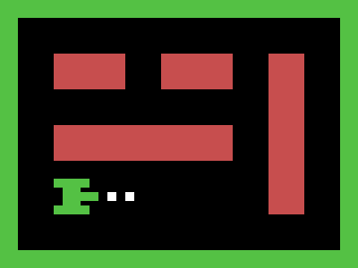
Solution:
<div></div>
<style>
  body {
    outline: 20px solid #54c144;
    border: solid 40px #000;
    margin: 20;
    background: linear-gradient(to left, #c74e4e 100px, #000 0);
  }
  body::before,
  body::after {
    position: fixed;
    content: "";
  }
  body::before {
    background: #c74e4e;
    width: 80;
    height: 40;
    box-shadow: 120px 0 0 #c74e4e, 120px 80px 0 #c74e4e, 0px 80px 0 #c74e4e, 40px
        80px 0 #c74e4e;
  }
  body::after {
    background: #fff;
    width: 10;
    height: 10;
    top: 215;
    left: 120;
    box-shadow: 20px 0 0 0 #fff;
  }
  div {
    background: #54c144;
    width: 50px;
    height: 40px;
    margin-top: 140px;
    clip-path: polygon(
      0 0,
      40px 0,
      40px 10px,
      30px 10px,
      30px 15px,
      50px 15px,
      50px 25px,
      30px 25px,
      30px 30px,
      40px 30px,
      40px 40px,
      0 40px,
      0 30px,
      10px 30px,
      10px 10px,
      0px 10px
    );
  }
</style>
Minified:
TBD
Duck Hunt
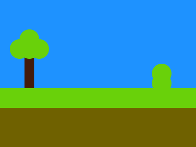
Solution:
<div></div>
<style>
  body {
    background: linear-gradient(
        #1e92ff 115px,
        transparent 115px,
        transparent 180px,
        #69d10a 180px,
        #69d10a 220px,
        #6f6100 0
      ), linear-gradient(to right, #1e92ff 50px, #441a0a 50px, #441a0a 70px, #1e92ff
          0);
  }
  div {
    width: 40px;
    height: 40px;
    background: #69d10a;
    border-radius: 50%;
    margin: 60px 32px;
    box-shadow: 0 20px 0 0 #69d10a, 20px 20px 0 0 #69d10a,
      -20px 20px 0 0 #69d10a, 270px 70px 0 0 #69d10a, 270px 90px 0 0 #69d10a;
  }
</style>
Minified:
<p><style>&{background:linear-gradient(#1E92FF 115q,#00000000 0 60%,#69D10A 0 55vw,#6F6100 0),linear-gradient(90deg,#1E92FF 53q,#441A0A 0 74q,#1E92FF 0)}p{width:40;height:40;background:#69D10A;border-radius:50%;margin:60 32;color:69D10A;box-shadow:0 21q,21q 21q,-20px 20px,270px 70px,270px 90px
Tetris
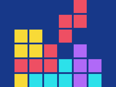
Solution:
<div></div>
<style>
  body {
    background: #173889;
  }
  div {
    width: 45px;
    height: 45px;
    background: #f8da37;
    margin: 102px 42px;
    box-shadow: 0 51px 0 0 #f8da37, 0 102px 0 0 #ee4f63, 0 153px 0 0 #f8da37, 51px
        0px 0 0 #f8da37, 51px 51px 0 0 #f8da37, 51px 102px 0 0 #ee4f63,
      51px 153px 0 0 #2ce1ea, 102px 51px 0 0 #ee4f63, 102px 102px 0 0 #ee4f63, 102px
        153px 0 0 #2ce1ea, 153px -51px 0 0 #ee4f63, 153px 0px 0 0 #ee4f63,
      153px 102px 0 0 #2ce1ea, 153px 153px 0 0 #2ce1ea, 204px -102px 0 0 #ee4f63,
      204px -51px 0 0 #ee4f63, 204px 51px 0 0 #b069f7, 204px 102px 0 0 #b069f7,
      204px 153px 0 0 #b069f7, 255px 102px 0 0 #b069f7, 255px 153px 0 0 #2ce1ea;
  }
</style>
Minified:
<body bgcolor=173889><p><style>p{width:45;height:45;background:#F8DA37;margin:102 42;color:EE4F63;box-shadow:0 54q#F8DA37,0 108q,0 162q#F8DA37,54q 0#F8DA37,54q 54q#F8DA37,54q 108q,54q 162q#2CE1EA,108q 54q,108q 108q,108q 162q#2CE1EA,162q -54q,162q 0,162q 108q#2CE1EA,162q 162q#2CE1EA,216q -108q,216q -54q,216q 54q#B069F7,216q 108q#B069F7,216q 162q#B069F7,270q 108q#B069F7,270q 162q#2CE1EA
Snake
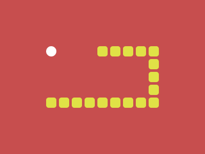
Solution:
<div></div>
<style>
  body {
    background: radial-gradient(circle at 100px 100px, #fff 10px, #c74e4e 0);
  }
  div {
    width: 20px;
    height: 20px;
    background: #e0e246;
    border-radius: 5px;
    margin: 190px 82px;
    box-shadow: 25px 0 0 0 #e0e246, 50px 0 0 0 #e0e246, 75px 0 0 0 #e0e246, 100px
        0 0 0 #e0e246, 125px 0 0 0 #e0e246, 150px 0 0 0 #e0e246,
      175px 0 0 0 #e0e246, 200px 0 0 0 #e0e246, 200px -25px 0 0 #e0e246, 200px -50px
        0 0 #e0e246, 200px -75px 0 0 #e0e246, 200px -100px 0 0 #e0e246,
      175px -100px 0 0 #e0e246, 150px -100px 0 0 #e0e246,
      125px -100px 0 0 #e0e246, 100px -100px 0 0 #e0e246;
  }
</style>
Minified:
<p><style>&{background:radial-gradient(circle at 25vw 25vw,#FFF 10px,#C74E4E 0)}p{width:20;height:20;background:#E0E246;color:E0E246;border-radius:5q;margin:190 82;box-shadow:26q 0,53q 0,79q 0,25vw 0,132q 0,50vh 0,185q 0,50vw 0,50vw -26q,50vw -53q,50vw -79q,50vw -25vw,185q -25vw,50vh -25vw,132q -25vw,25vw -25vw
Space Invaders
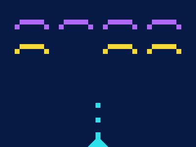
Solution:
<style>
  body {
    background: linear-gradient(-135deg, #071945 339px, transparent 100px),
      linear-gradient(135deg, #071945 339px, #2ce1ea 100px);
  }
  body::before {
    content: "";
    position: fixed;
    width: 50px;
    height: 10px;
    background: #b069f7;
    top: 40px;
    left: 40px;
    box-shadow: 90px 0 0 0 #b069f7, 180px 0 0 0 #b069f7, 270px 0 0 0 #b069f7, 0px
        50px 0 0 #f8da37, 180px 50px 0 0 #f8da37, 270px 50px 0 0 #f8da37;
  }
  body::after {
    content: "";
    position: fixed;
    width: 10px;
    height: 10px;
    background: #b069f7;
    top: 50px;
    left: 30px;
    box-shadow: 60px 0 0 0 #b069f7, 90px 0 0 0 #b069f7, 150px 0 0 0 #b069f7, 180px
        0 0 0 #b069f7, 240px 0 0 0 #b069f7, 270px 0 0 0 #b069f7,
      330px 0 0 0 #b069f7, 0px 50px 0 0 #f8da37, 60px 50px 0 0 #f8da37, 180px
        50px 0 0 #f8da37, 240px 50px 0 0 #f8da37, 270px 50px 0 0 #f8da37,
      330px 50px 0 0 #f8da37, 165px 160px 0 0 #2ce1ea, 165px 190px 0 0 #2ce1ea, 165px
        220px 0 0 #2ce1ea, 165px 230px 0 0 #2ce1ea;
  }
</style>
Minified:
<body bgcolor=071945><p><p a><p a b><h1><style>p{width:50;height:10;background:#B069F7;margin:40 32;color:B069F7;box-shadow:95q 0,60vh 0,90vh 0,0 53q#F8DA37,
60vh 53q#F8DA37,90vh 53q#F8DA37}[a]{width:10;margin:-40 22;background:#B069F7;box-shadow: 63q 0,95q 0,50vh 0,60vh 0,80vh 0,90vh 0,349q 0,175q 169q#2CE1EA,175q 201q#2CE1EA,175q 233q#2CE1EA,175q 240q#2CE1EA}[b]{background:#F8DA37;color:F8DA37;margin:80 22;box-shadow:64q 0,60vh 0,80vh 0,90vh 0,349q 0}h1{width:45;height:20;background:#2CE1EA;margin:170;clip-path:polygon(50%0,100%100%,0%100%