Float
Sharingan
Solution:
<div></div>
<style>
  body {
    background: #161616;
    margin: 0;
    display: grid;
    place-items: center;
  }
  div {
    width: 190px;
    height: 190px;
    background: #a22015;
    border-radius: 50%;
    border: solid 5px #000000;
    position: relative;
    overflow: hidden;
  }
  div::before {
    position: absolute;
    content: "";
    width: 50px;
    height: 50px;
    background: #000000;
    border-radius: 50%;
    top: 70px;
    left: 70px;
    box-shadow: 0 0 0 10px #e96a23, 0 0 0 25px #000000,
      74px -43px 0 10px #a22015, 74px -43px 0 25px #000000,
      -74px -43px 0 10px #a22015, -74px -43px 0 25px #000000,
      0px 85px 0 10px #a22015, 0px 85px 0 25px #000000;
  }
</style>
Minified:
TBD
One Piece

Solution:
<div></div>
<p></p>
<p></p>
<p></p>
<p></p>
<style>
  body {
    background: #000000;
  }
  body::after {
    content: "";
    position: absolute;
    background: #ffffff;
    width: 15px;
    height: 20px;
    top: 220px;
    left: 173px;
    box-shadow: 20px 0 0 0 #ffffff, 40px 0 0 0 #ffffff;
  }
  div {
    width: 150px;
    height: 100px;
    background: #ffffff;
    border-radius: 100px;
    margin: 110px auto;
  }
  div::before,
  div::after {
    content: "";
    position: absolute;
    width: 50px;
    height: 40px;
    background: #000000;
    border-radius: 50%/50%;
    top: 140px;
    left: 145px;
    transform: rotate(-30deg);
  }
  div::after {
    left: 205px;
    transform: rotate(30deg);
  }
  p {
    position: fixed;
    background: #ffffff;
    width: 20px;
    height: 25px;
    top: 83px;
    left: 112px;
    z-index: 1;
    transform: rotate(-45deg);
  }
  p::before {
    position: absolute;
    content: "";
    width: 25px;
    height: 25px;
    border-radius: 50%;
    background: #ffffff;
    top: -13;
    left: -10;
    box-shadow: 15px 0 0 0 #ffffff;
  }
  p:nth-child(2) {
    left: 268px;
    transform: rotate(45deg);
  }
  p:nth-child(3) {
    top: 180px;
    left: 112px;
    transform: rotate(-135deg);
  }
  p:nth-child(4) {
    top: 180px;
    left: 268px;
    transform: rotate(135deg);
  }
</style>
Minified:
TBD
Super Saiyan
Solution:
<div></div>
<p></p>
<style>
  body {
    background: #161616;
    position: relative;
  }
  body::after {
    position: absolute;
    content: "";
    background: #161616;
    width: 20px;
    height: 10px;
    border-radius: 0 0 10px 10px;
    top: 188px;
    left: 182px;
  }
  div {
    width: 80px;
    height: 70px;
    background: linear-gradient(to right, #ffffff 40px, #ffdeb9 25px);
    position: relative;
    top: 138px;
    left: 152px;
    border-radius: 0px 0px 50px 50px;
  }
  div::before,
  div::after {
    position: absolute;
    content: "";
    width: 55px;
    height: 30px;
    background: #ebae11;
    border-radius: 0px 0px 50px 50px;
    z-index: -1;
    top: 12px;
    left: 47px;
    transform: rotate(-10deg);
  }
  div::before {
    top: 13px;
    left: -22px;
    transform: rotate(15deg);
  }
  p {
    width: 60px;
    height: 60px;
    background: #ebae11;
    border-radius: 100% 0px;
    position: relative;
    z-index: 1;
    left: 162px;
    transform: rotate(-45deg);
    top: 2px;
  }
  p::before,
  p::after {
    content: "";
    position: absolute;
    width: 60px;
    height: 28px;
    background: #ebae11;
    border-radius: 0px 0px 50px 50px;
  }
  p::before {
    top: 52px;
    left: 3px;
    transform: rotate(-15deg);
  }
  p::after {
    top: 12px;
    left: -35px;
    transform: rotate(107deg);
  }
</style>
Minified:
TBD
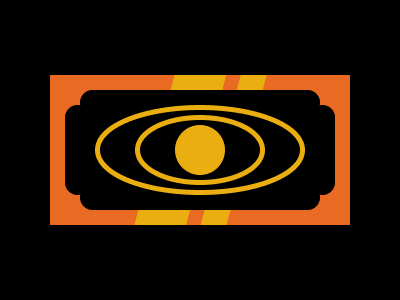
Amegakure
Solution:
<div></div>
<style>
  body {
    background: #000;
    display: grid;
    place-items: center;
    position: relative;
  }
  body::before {
    position: absolute;
    content: "";
    width: 240px;
    height: 120px;
    top: 82px;
    left: 72px;
    background: #37385a;
    border-radius: 20px;
  }
  div {
    width: 200px;
    height: 80px;
    background: linear-gradient(
      105deg,
      #9897ae 0px,
      #9897ae 82px,
      #c0c3db 82px,
      #c0c3db 132px,
      #9897ae 0px
    );
    border-radius: 10px;
    position: relative;
  }
  div::before,
  div::after {
    position: absolute;
    content: "";
    top: 0;
    left: 0;
  }
  div::before {
    width: 10px;
    height: 10px;
    border-radius: 50%;
    background: #000;
    top: 15px;
    left: 15px;
    box-shadow: 0 0 0 0 #000, 0 20px 0 0 #000, 0 40px 0 0 #000, 160px 0px 0 0
        #000, 160px 20px 0 0 #000, 160px 40px 0 0 #000;
  }
  div::after {
    width: 10px;
    height: 50px;
    border-radius: 5px;
    background: #000;
    top: 15px;
    left: 65px;
    box-shadow: 20px 0 0 0 #000, 40px 0 0 0 #000, 60px 0 0 0 #000;
  }
</style>
Minified:
<body bgcolor=000><p><h1 c><h2 c><h2 b c><style>p{width:240;height:120;margin:90 72;background:#37385A;border-radius:20q}h1{width:200;height:80;background:linear-gradient(-75deg,#9897AE 87q,#C0C3DB 0 140q,#9897AE 0);border-radius:10q;margin:-190 92}h2{width:10;height:10;background:#000;color:000;margin:125 107;box-shadow:0 21q,0 42q,169q 0,169q 21q,169q 42q}[b]{height:50;margin:-135 157;box-shadow:21q 0,42q 0,63q 0}[c]{border-radius:10q
Ryuk
Solution:
<p></p>
<p></p>
<style>
  body {
    background: linear-gradient(45deg, #bac7ce 289px, transparent 289px),
      linear-gradient(-45deg, #bac7ce 289px, #475862 289px);
  }
  body::before,
  body::after {
    content: "";
    position: fixed;
    width: 100px;
    height: 100px;
    border-radius: 50%;
    box-shadow: 0 -15px 0 0 #5a6042;
    z-index: 1;
    top: 155px;
    left: 40px;
  }
  body::after {
    top: 155px;
    left: 260px;
  }
  p {
    width: 120px;
    height: 120px;
    background: radial-gradient(
      circle at center,
      #4e2b24 15px,
      #000000 15px,
      #000000 20px,
      #868a64 20px,
      #868a64 50px,
      #000000 50px
    );
    position: relative;
    border-radius: 0px 50%;
    top: 122px;
    left: 22px;
    transform: rotate(-15deg);
  }
  p:nth-child(2) {
    top: -14px;
    left: 242px;
    transform: rotate(-75deg);
  }
</style>
Minified:
TBD
Ryuk’s Apple
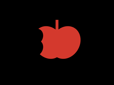
Solution:
<div></div>
<style>
  body {
    background: #000000;
  }
  div {
    width: 10px;
    height: 40px;
    background: #d4392d;
    margin: 70 auto;
    position: relative;
  }
  div::before,
  div::after {
    position: absolute;
    content: "";
    width: 87px;
    height: 115px;
    background: #d4392d;
    border-radius: 40px 44px 65px 22px;
    top: 22.5px;
  }
  div::after {
    left: -75;
    border-radius: 44px 40px 27px 65px;
  }
  body::before,
  body::after {
    position: absolute;
    content: "";
    width: 50px;
    height: 45px;
    background: #000000;
    top: 101px;
    left: 101px;
    z-index: 1;
    border-radius: 0 23px 13px 0;
  }
  body::after {
    top: 145px;
    border-radius: 0 16px 19px 0;
  }
</style>
Minified:
TBD
Sealing Wand

Solution:
<div>
  <p></p>
</div>
<style>
  body {
    background: #161616;
  }
  div {
    width: 60px;
    height: 60px;
    border-radius: 50%;
    background: radial-gradient(
      circle at center,
      #161616 10px,
      #a22015 10px,
      #a22015 15px,
      #ffffff 15px,
      #ffffff 25px,
      #a22015 25px
    );
    margin: 120 auto;
    position: relative;
  }
  div::before,
  div::after,
  p,
  p::before,
  p::after,
  body::before {
    position: absolute;
    content: "";
  }
  div::before {
    width: 30px;
    height: 28px;
    background: #a22015;
    bottom: -23;
    left: 15;
    border-radius: 0 0 10px 10px;
  }
  div::after {
    width: 20px;
    height: 100px;
    background: #e96a23;
    bottom: -120;
    left: 20;
    z-index: -1;
  }
  p {
    width: 55px;
    height: 12px;
    background: #ffffff;
    top: -4;
    left: -40;
    border-bottom-left-radius: 15px;
  }
  p::before {
    width: 35px;
    height: 14px;
    background: #ffffff;
    top: 10;
    left: 15;
    border-bottom-left-radius: 12px;
  }
  p::after {
    width: 25px;
    height: 12px;
    background: #ffffff;
    top: 24;
    left: 30;
    border-bottom-left-radius: 15px;
  }
  body::before {
    width: 90px;
    height: 40px;
    background: #e96a23;
    z-index: -1;
    top: 129px;
    left: 190px;
    border-radius: 0 40px 5px 0;
  }
</style>
Minified:
TBD
Clow Card
Solution:
<div></div>
<style>
  body {
    background: linear-gradient(
        to left,
        #000000 50px,
        transparent 50px,
        transparent 350px,
        #000000 350px
      ), linear-gradient(
        to top,
        #000000 75px,
        transparent 75px,
        transparent 225px,
        #000000 225px
      ), linear-gradient(-75deg, #e96a23 187px, #ebae11 187px, #ebae11 212px, #e96a23
          212px, #e96a23 226px, #ebae11 226px, #ebae11 276px, #e96a23 276px);
  }
  div {
    width: 240px;
    height: 120px;
    background: radial-gradient(circle at center, #ebae11 25px, #000000 25px);
    position: relative;
    top: 82px;
    left: 72px;
    border-radius: 13px;
  }
  div::before,
  div::after {
    position: absolute;
    content: "";
    border: solid 5px #ebae11;
    border-radius: 50%;
  }
  div::before {
    width: 120px;
    height: 60px;
    top: 25px;
    left: 55px;
  }
  div::after {
    width: 200px;
    height: 80px;
    top: 15px;
    left: 15px;
  }
  body::before {
    content: "";
    position: absolute;
    width: 270px;
    height: 90px;
    background: #000000;
    top: 105px;
    left: 65px;
    border-radius: 13px;
  }
</style>
Minified:
TBD