Aspect
Summit
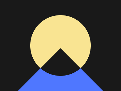
Solution:
<div></div>
<style>
  body {
    background: radial-gradient(
      circle at 200px 150px,
      #f9e492 100px,
      #191919 100px
    );
  }
  div {
    width: 300px;
    height: 300px;
    background: radial-gradient(
      circle at 150px 141px,
      #191919 100px,
      #4f77ff 100px
    );
    margin: 9px auto;
    clip-path: polygon(50% 50%, 100% 100%, 0 100%);
  }
</style>
Minified:
<p><style>&{background:radial-gradient(circle at 50%50vh,#F9E492 25vw,#191919 0)}p{width:300;height:300;background:radial-gradient(circle at 50%149q,#191919 25vw,#4F77FF 0);margin:9 42;clip-path:polygon(50%50%,100%100%,0 100%
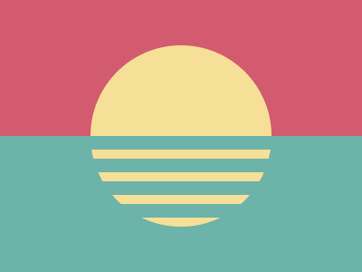
Eclipse

Solution:
<style>
  body {
    margin: 0;
    background: radial-gradient(
        circle at 50% 350px,
        #998235 200px,
        transparent 200px
      ), radial-gradient(
        circle,
        #1a4341 100px,
        #f3ac3c 100px,
        #f3ac3c 125px,
        transparent 125px
      ), radial-gradient(circle at 50% -50px, #998235 200px, #f3ac3c 200px);
  }
</style>
Minified:
<style>&{background:radial-gradient(circle at 50%350px,#998235 50vw,#00000000 0),radial-gradient(1q,#1A4341 25vw,#F3AC3C 0,#F3AC3C 125px,#00000000 0),radial-gradient(circle at 50%-50px,#998235 50vw,#F3AC3C 0
Reflection
Solution:
<style>
  body {
    background: linear-gradient(
        transparent 150px,
        #6cb3a9 150px,
        #6cb3a9 165px,
        transparent 165px,
        transparent 175px,
        #6cb3a9 175px,
        #6cb3a9 190px,
        transparent 190px,
        transparent 200px,
        #6cb3a9 200px,
        #6cb3a9 215px,
        transparent 215px,
        transparent 225px,
        #6cb3a9 225px,
        #6cb3a9 240px,
        transparent 240px,
        transparent 250px
      ), radial-gradient(circle, #f6df96 100px, transparent 100px),
      linear-gradient(#d25b70 50%, #6cb3a9 50%);
  }
</style>
Minified:
<style>&{background: linear-gradient(#00000000 50%,#6CB3A9 50%174q,#00000000 165px 185q,#6CB3A9 180q 190px,#00000000 190q 50vw,#6CB3A9 50vw 215px,#00000000 215q 225px,#6CB3A9 225q 60vw,#00000000 60vw 250q),radial-gradient(110q,#F6DF96 96%,#00000000 0),linear-gradient(#D25B70 50%,#6CB3A9 0
Squeeze
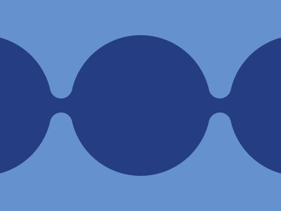
Solution:
<style>
  body {
    background: radial-gradient(
        circle at 87px 125px,
        #6592cf 15px,
        transparent 15px
      ), radial-gradient(circle at 87px 175px, #6592cf 15px, transparent 15px),
      radial-gradient(circle at 312px 125px, #6592cf 15px, transparent 15px),
      radial-gradient(circle at 312px 175px, #6592cf 15px, transparent 15px),
      linear-gradient(
        transparent 130px,
        #243d83 130px,
        #243d83 170px,
        transparent 170px
      ), radial-gradient(circle, #243d83 100px, transparent 100px),
      radial-gradient(circle at -25px, #243d83 100px, transparent 100px),
      radial-gradient(circle at 425px, #243d83 100px, #6592cf 100px);
  }
</style>
Minified:
<body bgcolor=6592CF><p><h1><style>p{width:200;height:200;background:#243D83;border-radius:50%;margin:50-134;color:243D83;box-shadow:226px 0,478q 0}h1{width:31;height:70;margin:-60%63.5;border-radius:22q;color:6592CF;box-shadow:0 96q,0 40px#243D83,226px 0,226px 90px,226px 40px#243D83
Great Wall
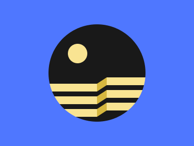
Solution:
<div></div>
<style>
  body {
    background: radial-gradient(
        circle at 160px 110px,
        #f9e492 20px,
        transparent 20px
      ), radial-gradient(circle, #191919 100px, #4f77ff 100px);
  }
  div {
    width: 200px;
    height: 200px;
    border-radius: 50%;
    margin: 50px auto;
    position: relative;
    overflow: hidden;
  }
  div::before,
  div::after {
    position: absolute;
    content: "";
  }
  div::before {
    background: #d6b73f;
    width: 22px;
    height: 16px;
    transform: skew(0, -32deg);
    top: 116px;
    left: 99px;
    box-shadow: 0 26px 0 0 #d6b73f, 0 52px 0 0 #d6b73f;
  }
  div::after {
    background: #f9e492;
    width: 101px;
    height: 16px;
    top: 122px;
    left: 0px;
    box-shadow: 0 26px 0 0 #f9e492, 0 52px 0 0 #f9e492, 121px -13px 0 0 #f9e492,
      121px 13px 0 0 #f9e492, 121px 39px 0 0 #f9e492;
  }
</style>
Minified:
TBD
Ripples

Solution:
<style>
  body {
    background: radial-gradient(
      circle,
      #f3ac3c 20px,
      #0e2e2c 20px,
      #0e2e2c 28px,
      #f3ac3c 28px,
      #f3ac3c 40px,
      #0e2e2c 40px,
      #0e2e2c 50px,
      #998235 50px,
      #998235 60px,
      #0e2e2c 60px,
      #0e2e2c 72px,
      #f3ac3c 72px,
      #f3ac3c 80px,
      #0e2e2c 80px,
      #0e2e2c 94px,
      #f3ac3c 94px,
      #f3ac3c 100px,
      #0e2e2c 100px
    );
  }
</style>
Minified:
<style>*{background:radial-gradient(circle,#F3AC3C 21q,#0E2E2C 0 7vw,#F3AC3C 7vw 5ch,#0E2E2C 0 53q,#998235 0 25%,#0E2E2C 0 9ch,#F3AC3C 0 5em,#0E2E2C 0 99q,#F3AC3C 0 25vw,#0E2E2C 0
Pokeball

Solution:
<div></div>
<style>
  body{
    background: radial-gradient(circle, #781728 90px, #6CB3A9 50px);
  }
  div {
    margin: 50px auto;
    width: 200px;
    height: 200px;
    border-radius: 50%;
    background: linear-gradient(#D25B70 90px, #781728 90px, #781728 110px,  #FFFFFF 110px);
    position: relative:
  }
  div::before, div::after{
    position: absolute;
    content: "";
    width: 10px;
    height: 20px;
    top: 140px;
    background: #6CB3A9;
    box-shadow: 190px 0 0 0 #6CB3A9;
  }
  div::after{
    width: 50px;
    height: 50px;
    background: #F6DF96;
    border-radius: 50%;
    border: solid 10px #781728;
    top: 115px;
    left: 165px;
  }
</style>
Minified:
<body bgcolor=6CB3A9><p><h1><style>p{width:200;height:200;margin:50 92;border-radius:50%;background:radial-gradient(1q,#F6DF96 26q,#781728 0 37q,#00000000 0),linear-gradient(#D25B70 95q,#781728 0 110px,#FFF 0)}h1{width:10;height:20;background:#6CB3A9;margin:-160 92;box-shadow:200q 0#6CB3A9
Mandala
Solution:
<div></div>
<style>
  body {
    background: radial-gradient(circle, #6592cf 100px, #243d83 0px);
  }
  body::before,
  body::after,
  div::before,
  div::after {
    width: 130px;
    height: 130px;
    position: absolute;
    content: "";
    border-radius: 50%;
    border: solid 20px #243d83;
    top: -10px;
    left: 115px;
  }
  body::after {
    top: 140px;
  }
  div::before,
  div::after {
    top: 65px;
    left: 40px;
  }
  div::after {
    left: 190px;
  }
</style>
Minified:
<body bgcolor=243D83><p><p a><p b><p b c><p d><style>
  p{
    width:130;
    aspect-ratio:1;
    position:fixed;
    border:solid 20px#243D83;
    border-radius:50%;
    top:49;
    left:40
  }
  [a]{
    left:190
  }
  [b]{
    top:-26;
    left:115;
  }
  [c]{
    top:124;
  }
  [d]{
    background:#6592CF;
    top:14;
    left:80;
    z-index:-1;
    width:200;
  }