Zindex
Notes

Solution:
<div></div>
<style>
  body {
    background: #191919;
  }
  body::before,
  body::after {
    content: "";
    position: absolute;
    background: #fe5f55;
    top: 170px;
    left: 55px;
    box-shadow: 70px 0 0 0 #fe5f55, 140px 0 0 0 #a64942, 210px 0 0 0 #fe5f55;
  }
  body::before {
    width: 10px;
    height: 100px;
    left: 95px;
    top: 90px;
  }
  body::after {
    width: 50px;
    height: 40px;
    border-radius: 50%;
  }
  div {
    width: 40px;
    height: 10px;
    background: #fe5f55;
    position: absolute;
    top: 90px;
    left: 95px;
    box-shadow: 30px 0 0 0 #fe5f55, 140px 0 0 0 #a64942, 210px 0 0 0 #fe5f55, 210px
        20px 0 0 #fe5f55;
  }
</style>
Minified:
<body bgcolor=191919><p a><p b><p c><style>p{background:#A64942;color:FE5F55;width:40;height:10;margin:90 227;box-shadow:-148q 0,-74q 0,74q 0}[a]{box-shadow:-148q 0,-25vw 0,74q 0,74q 21q}[b]{width:10;height:90;margin:-90 227}[c]{width:50;height:40;margin:70 187;border-radius:50%
Ukelele

Solution:
<div></div>
<style>
  body {
    background: radial-gradient(
        circle at 165px 50%,
        #1a4341 20px,
        #f3ac3c 20px,
        #f3ac3c 25px,
        #998235 25px,
        #998235 50px,
        transparent 50px
      ), radial-gradient(circle at 105px 50%, #998235 60px, transparent 60px),
      linear-gradient(
        to right,
        #f3ac3c 50px,
        transparent 10px,
        transparent 325px,
        #f3ac3c 325px
      ), linear-gradient(#f3ac3c 140px, #1a4341 140px, #1a4341 160px, #f3ac3c
          160px);
  }
  div {
    width: 40px;
    height: 30px;
    background: #998235;
    border-radius: 10px;
    position: relative;
    left: 307px;
    top: 127px;
  }
  div::before,
  div::after {
    position: absolute;
    content: "";
    width: 20px;
    height: 4px;
    background: #1a4341;
    top: 8px;
    left: 10px;
    border-radius: 2px;
    box-shadow: 0 10px 0 0 #1a4341;
  }
  div::after {
    width: 40px;
    height: 10px;
    left: -245px;
    border-radius: 4px;
    top: 10px;
    box-shadow: none;
    transform: rotate(90deg);
  }
</style>
Minified:
<p><p a b><p b><p c><p d><style>body{background:radial-gradient(100q at 105px 50%, #998235 64q,#F3AC3C 0)}p{width:175;height:20;background:#1A4341;margin:140;border-radius:50q}[b]{width:10;height:40;margin:130 77 0}[a]{width:40;margin:-175 132;border:solid 5px#F3AC3C;outline:solid 27q#998235}[c]{width:40;height:30;background:#998235;border-radius:10q;margin:-35 307}[d]{width:20;height:4;margin:13 317;box-shadow:0 11q#1A4341
Tambourine
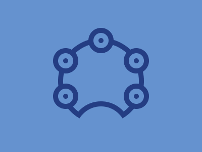
Solution:
<div></div>
<style>
  body {
    background: #6592cf;
  }
  div {
    width: 150px;
    height: 150px;
    background: #6592cf;
    border: solid 10px #243d83;
    border-radius: 50%;
    margin: 75px auto;
    position: relative;
    clip-path: circle(85px);
  }
  div::before {
    content: "";
    position: absolute;
    width: 100px;
    height: 100px;
    background: #6592cf;
    border: solid 10px #243d83;
    border-radius: 50%;
    top: 115px;
    left: 15px;
  }
  body::before {
    content: "";
    position: absolute;
    width: 10px;
    height: 10px;
    background: #243d83;
    border-radius: 50%;
    top: 75px;
    left: 195px;
    z-index: 1;
    box-shadow: 0 0 0 0 red, 0 0 0 10px #6592cf, 0 0 0 20px #243d83, 70px 40px 0
        0 #243d83, 70px 40px 0 10px #6592cf, 70px 40px 0 20px #243d83,
      70px 110px 0 0 #243d83, 70px 110px 0 10px #6592cf,
      70px 110px 0 20px #243d83, -70px 40px 0 0 #243d83,
      -70px 40px 0 10px #6592cf, -70px 40px 0 20px #243d83,
      -70px 110px 0 0 #243d83, -70px 110px 0 10px #6592cf,
      -70px 110px 0 20px #243d83;
  }
</style>
Minified:
<body bgcolor=6592CF><p><p a><p b><p c><p d><h1><h2><style>p,h1,h2{color:243D83;aspect-ratio:1;border-radius:50%;border:solid 10px}p{position:fixed;background:#243D83;border-color:6592CF;width:10;outline:solid 10px;border-radius:50%;top:89;left:115}p[a]{left:255}p[b]{top:159}p[c]{left:255;top:159}p[d]{left:185;top:49}h1{width:150;margin:75 107}h2{width:100;margin:-120 132;background:#6592CF;clip-path:polygon(15%0,105%0,105%18%,50%46%,15%33px
Piano
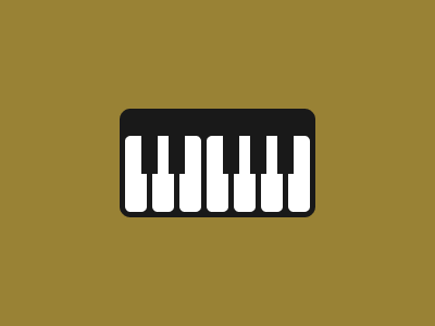
Solution:
<div></div>
<style>
  body {
    background: #998235;
  }
  div {
    width: 180px;
    height: 100px;
    border-radius: 10px;
    background: #191919;
    margin: 100px auto;
    position: relative;
  }
  div::before,
  div::after {
    content: "";
    position: absolute;
    width: 20px;
    height: 70px;
    background: #ffffff;
    left: 5px;
    top: 25px;
    border-radius: 5px;
  }
  div::before {
    box-shadow: 25px 0 0 0 #ffffff, 50px 0 0 0 #ffffff, 75px 0 0 0 #ffffff, 100px
        0 0 0 #ffffff, 125px 0 0 0 #ffffff, 150px 0 0 0 #ffffff;
  }
  div::after {
    height: 35px;
    background: #191919;
    width: 15px;
    border-radius: 0px;
    left: 20px;
    box-shadow: 25px 0 0 0 #191919, 75px 0 0 0 #191919, 100px 0 0 0 #191919, 125px
        0 0 0 #191919;
  }
</style>
Minified:
<body bgcolor=998235><p><p a><p b><style>p{width:180;height:100;border-radius:10q;background:#191919;margin:26%102}[a]{width:20;height:70;background:#FFF;color:FFF;margin:-175 107;border-radius:6q;box-shadow:27q 0,53q 0,80q 0,25vw 0,132q 0,50vh 0}[b]{width:15;height:35;border-radius:0;color:191919;margin:105 122;box-shadow:27q 0,80q 0,25vw 0,132q 0