Clip
PushOwl

Solution:
<div></div>
<style>
  body {
    background: linear-gradient(transparent 140px, #191919 140px),
      radial-gradient(
        circle at 146px 140px,
        #191919 6px,
        #e08027 6px,
        #e08027 15px,
        transparent 15px
      ), radial-gradient(circle at 254px 140px, #191919 6px, #e08027 6px, #e08027
          15px, #191919 15px);
  }
  div {
    position: relative;
    z-index: 1;
  }
  body::before {
    position: absolute;
    content: "";
    width: 40px;
    height: 50px;
    background: #e08027;
    top: 166px;
    left: 176px;
    z-index: -1;
    transform: rotate(-45deg);
  }
  div::before,
  div::after {
    position: absolute;
    content: "";
    margin: 76px auto;
    width: 115px;
    height: 115px;
    background: radial-gradient(circle, transparent 45px, #e08027 40px);
    border-radius: 0px 50% 50% 50%;
    left: 80px;
    top: -8px;
  }
  div::after {
    top: -17px;
    left: 178px;
    transform: rotate(90deg);
    border: solid 10px #191919;
    z-index: 2;
  }
</style>
Minified:
TBD
Froggy

Solution:
<div></div>
<style>
  body {
    background: #293462;
  }
  body::after {
    position: absolute;
    content: "";
    z-index: 1;
    background: #293462;
    width: 10px;
    height: 10px;
    border-radius: 50%;
    top: 105px;
    left: 160px;
    box-shadow: 45px 55px 0 0 #293462, 25px 55px 0 0 #293462, 0 0 0 10px #fff1c1,
      0 0 0 20px #fe5f55, 70px 0 0 0 #293462, 70px 0 0 10px #fff1c1,
      70px 0 0 20px #fe5f55;
  }
  div {
    width: 150px;
    height: 100px;
    background: #a64942;
    border-radius: 50px;
    position: relative;
    margin: 110px auto;
    overflow: hidden;
  }
  div::after {
    position: absolute;
    content: "";
    background: #fe5f55;
    width: 435px;
    height: 435px;
    border-radius: 50%;
    top: -365px;
    left: -142px;
  }
</style>
Minified:
TBD
Elephant

Solution:
<div></div>
<p></p>
<p>
  <style>
    body {
      background: #998235;
    }
    div {
      width: 180px;
      height: 180px;
      border-radius: 50%;
      margin: 60px auto;
      background: #1a4341;
      position: relative;
    }
    div::before,
    div::after,
    body::before,
    body::after,
    p::before,
    p::after {
      content: "";
      position: absolute;
    }
    div::before,
    div::after {
      width: 80px;
      height: 180px;
      background: #0b2429;
      border-radius: 50%;
      z-index: -1;
      left: -60px;
      box-shadow: inset 14px 0 0px 2px #1a4341;
    }
    div::after {
      left: 160px;
      transform: rotate(180deg);
    }
    body::before,
    body::after {
      width: 20px;
      height: 10px;
      background: #0b2429;
      border: solid 10px #998235;
      border-radius: 0px 0px 20px 20px;
      border-top: 0;
      top: 50%;
      left: 150px;
      z-index: 1;
    }
    body::after {
      left: 210px;
    }
    p::before {
      width: 40px;
      height: 120px;
      background: #0b2429;
      border-radius: 40px 40px 0 0;
      bottom: 0px;
      left: 180px;
      z-index: 1;
    }
    p::after {
      box-sizing: border-box;
      width: 120px;
      height: 60px;
      border: solid 20px #ffffff;
      border-bottom: none;
      border-radius: 60px 60px 0 0;
      bottom: 50px;
      left: 140px;
    }
  </style>
</p>
Minified:
TBD
Sheep

Solution:
<div></div>
<style>
  body {
    background: radial-gradient(
        circle at 190px 135px,
        #6592cf 5px,
        transparent 5px
      ), radial-gradient(circle at 210px 135px, #6592cf 5px, #243d83 5px);
    position: relative;
  }
  div {
    width: 60px;
    height: 75px;
    margin: 80px auto;
    border: solid 20px #6592cf;
    border-radius: 50px;
  }
  div::before,
  div::after,
  body::before,
  body::after {
    position: absolute;
    content: "";
    width: 60px;
    height: 50px;
    background: #6592cf;
    border-radius: 55%;
    top: 0;
    left: 0;
    z-index: 1;
  }
  div::before {
    top: -15px;
    left: 162px;
    box-shadow: 0 120px 0 0 #6592cf;
  }
  div::after {
    transform: rotate(45deg);
    top: 5px;
    left: 202px;
    box-shadow: 0 113px 0 0 #6592cf;
  }
  body::before {
    transform: rotate(90deg);
    top: 45px;
    left: 222px;
    box-shadow: 0 120px 0 0 #6592cf;
  }
  body::after {
    transform: rotate(-45deg);
    top: 5px;
    left: 122px;
    box-shadow: 0 113px 0 0 #6592cf;
  }
</style>
Minified:
TBD
Happy Tiger

Solution:
<div></div>
<p></p>
<style>
  body {
    background: radial-gradient(
        circle at 145px 95px,
        #1a4341 20px,
        #998235 20px,
        #998235 30px,
        transparent 30px
      ), radial-gradient(circle at 255px 95px, #1a4341 20px, #998235 20px, #998235
          30px, #f3ac3c 30px);
  }
  div::before,
  div::after,
  body::before,
  body::after,
  p,
  p::before,
  p::after {
    position: absolute;
    content: "";
  }
  div {
    width: 150px;
    height: 150px;
    margin: 75px auto;
    border-radius: 75px 75px 60px 60px;
    background: #998235;
    overflow: hidden;
    position: relative;
  }
  div::before {
    width: 100px;
    height: 40px;
    background: #ffffff;
    top: 95px;
    left: 25px;
    border-radius: 15px 15px 40px 40px;
  }
  div::after {
    width: 50px;
    height: 50px;
    background: #1a4341;
    transform: rotate(45deg);
    top: -35px;
    left: 50px;
  }
  body::before {
    width: 20px;
    height: 20px;
    background: #1a4341;
    border-radius: 50%;
    top: 135px;
    left: 150px;
    box-shadow: 80px 0 0 0px #1a4341;
    z-index: 1;
  }
  p::before,
  p::after {
    top: 0;
    left: 0;
    width: 20px;
    height: 50px;
    background: transparent;
    border: solid 10px #1a4341;
    border-radius: 50px;
    top: -30px;
    left: 0px;
    clip-path: polygon(0 50px, 100% 50px, 100% 100%, 0 100%);
  }
  p::after {
    left: -30px;
  }
  p {
    width: 10px;
    height: 33px;
    background: #1a4341;
    top: 144px;
    left: 195px;
  }
</style>
Minified:
TBD
Danger Noodle
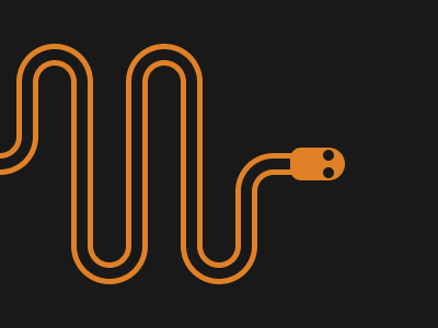
Solution:
<div></div>
<p></p>
<p></p>
<span></span>
<style>
  body {
    background: #191919;
  }
  div {
    width: 30px;
    height: 180px;
    margin: 60px 27px;
    border-radius: 50px;
    clip-path: polygon(
      -20px 10px,
      -20px 70px,
      0px 70px,
      0px 165px,
      -20px 165px,
      205px 165px,
      205px 110px,
      155px 110px,
      155px 10px
    );
    box-shadow: 50px 0 0 0px #191919, 50px 0 0 5px #e08027,
      50px 0 0 15px #191919, 50px 0 0 20px #e08027, 100px 0 0 0px #191919, 100px
        0 0 5px #e08027, 100px 0 0 15px #191919, 100px 0 0 20px #e08027,
      150px 0 0 0px #191919, 150px 0 0 5px #e08027, 150px 0 0 15px #191919, 150px
        0 0 20px #e08027, 200px 100px 0 0px #191919, 200px 100px 0 5px #e08027,
      200px 100px 0 15px #191919, 200px 100px 0 20px #e08027, 0 0 0 5px #e08027,
      0 0 0 15px #191919, 0 0 0 20px #e08027;
  }
  body::before,
  body::after,
  p::before,
  p::after,
  div::before {
    position: absolute;
    content: "";
    width: 30px;
    height: 15px;
    border: solid 5px #e08027;
    border-radius: 30px 30px 00 0;
    border-bottom: 0;
    top: 55px;
    left: 30px;
    box-shadow: 0 0 0 10px #191919, 0 0 0 15px #e08027;
    clip-path: polygon(-50px -30px, 100px -30px, 100px 20px, -50px 20px);
  }
  body::after {
    left: 130px;
  }
  p::before,
  p::after {
    top: 225px;
    transform: rotate(180deg);
    left: 80px;
  }
  p::after {
    left: 180px;
  }
  p:nth-child(2)::before {
    top: 125px;
    left: -20px;
  }
  p:nth-child(2)::after {
    width: 50px;
    top: 155px;
    left: 230px;
    transform: rotate(0deg);
  }
  span {
    display: inline-block;
    width: 50px;
    height: 30px;
    background: radial-gradient(
        circle at 35px 7px,
        #191919 5px,
        transparent 5px
      ), radial-gradient(circle at 35px 23px, #191919 5px, #e08027 5px);
    position: absolute;
    top: 135px;
    right: 85px;
    border-radius: 14px 20px 20px 14px;
    box-shadow: 0 12px 0 0 #191919;
  }
</style>
Minified:
TBD
Hippo
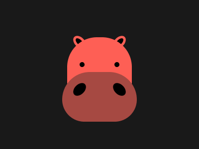
Solution:
<div></div>
<p></p>
<style>
  body {
    background: #191919;
  }
  div {
    width: 130px;
    height: 145px;
    background: radial-gradient(
        circle at 30px 55px,
        #000000 5px,
        transparent 5px
      ), radial-gradient(circle at 100px 55px, #000000 5px, #fe5f55 5px);
    margin: 75px auto;
    border-radius: 60px;
    position: relative;
  }
  div::before,
  div::after,
  body::before,
  body::after,
  p::before,
  p::after,
  p {
    position: absolute;
    content: "";
  }
  div::before,
  div::after {
    z-index: -1;
    width: 11px;
    height: 30px;
    background: #000000;
    border: solid 5px #fe5f55;
    border-radius: 50%;
    top: -6px;
    left: 18px;
    transform: rotate(-45deg);
  }
  div::after {
    transform: rotate(45deg);
    left: 92px;
  }
  p {
    width: 150px;
    height: 100px;
    background: #a64942;
    top: 130px;
    left: 125px;
    border-radius: 55px 55px 45px 45px;
  }
  p::before,
  p::after {
    width: 30px;
    height: 20px;
    border-radius: 50%;
    background: #000000;
    top: 23px;
    left: 20px;
    transform: rotate(-45deg);
  }
  p::after {
    transform: rotate(45deg);
    left: 100px;
  }
</style>
Minified:
TBD
Beeee
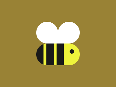
Solution:
<div></div>
<style>
  body {
    background: radial-gradient(
        circle at 163px 112px,
        #ffffff 37px,
        transparent 10px
      ), radial-gradient(circle at 237px 112px, #ffffff 37px, #998235 10px);
  }
  div {
    width: 150px;
    height: 75px;
    background: radial-gradient(
        circle at 122px 28px,
        #191919 7.5px,
        transparent 7.5px
      ), linear-gradient(to right, #191919 25px, #eff33c 25px, #eff33c 35px, #191919
          35px, #191919 60px, #eff33c 60px, #eff33c 70px, #191919 70px, #191919
          95px, #eff33c 95px, #eff33c 105px);
    background: ;
    margin: 150px auto;
    border-radius: 50px;
  }
  div::after {
    position: absolute;
    content: "";
    width: 145px;
    height: 40px;
    background: #ffffff;
    top: 110px;
    border-radius: 0 0 50px 50px;
  }
</style>
Minified:
<body bgcolor=998235><p><p a><h1><style>p{width:75;height:75;background:#FFF;border-radius:50%50%0 50%;margin:75 117}p[a]{scale:-1 1;margin:-150 192}h1{width:150;height:75;background:radial-gradient(circle at 122.5px 27.5px,#191919 7px,#00000000 0),linear-gradient(90deg,#191919 25px,#EFF33C 0,#EFF33C 35px,#191919 35px,#191919 60px,#EFF33C 0,#EFF33C 70px,#191919 70px,#191919 95px,#EFF33C 0,#EFF33C 105px);margin:39%117;border-radius:50px