Blend
ImprovMX
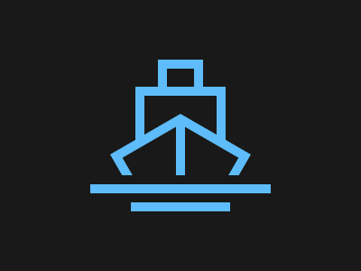
Solution:
<div></div>
<p></p>
<style>
  body {
    background: #191919;
    margin: 0;
  }
  body::before,
  body::after {
    content: "";
    position: absolute;
    width: 200px;
    height: 10px;
    background: #5dbcf9;
    top: 204px;
    left: 100px;
  }
  body::after {
    top: 224px;
    left: 145px;
    width: 110px;
  }
  div {
    margin: 96px auto;
    width: 80px;
    height: 50px;
    border: solid 10px #5dbcf9;
    position: relative;
    border-bottom: 0;
  }
  div::before {
    content: "";
    position: absolute;
    top: -40px;
    left: 15px;
    width: 30px;
    height: 20px;
    border: solid 10px #5dbcf9;
  }
  div::after {
    content: "";
    position: absolute;
    width: 10px;
    height: 60px;
    background: #5dbcf9;
    top: 30px;
    left: 35px;
  }
  p {
    position: relative;
    width: 200px;
    height: 10px;
    background: #191919;
    top: -57px;
    left: 100px;
  }
  p::before,
  p::after {
    content: "";
    position: absolute;
    width: 80px;
    height: 35px;
    border: solid 10px #5dbcf9;
    border-bottom: 0;
    border-right: 0;
    top: -50px;
    left: 26px;
    transform: rotate(-30deg);
    z-index: -1;
  }
  p::after {
    border: solid 10px #5dbcf9;
    border-bottom: 0;
    border-left: 0;
    left: 82px;
    transform: rotate(30deg);
  }
</style>
Minified:
TBD
Sunset

Solution:
<div></div>
<style>
  body {
    background: #191919;
    display: grid;
    place-items: center;
  }
  div {
    width: 150px;
    height: 200px;
    background: #f2ad43;
    border-radius: 100px 100px 30px 30px;
    position: relative;
    overflow: hidden;
  }
  div::before {
    position: absolute;
    content: "";
    width: 53px;
    height: 53px;
    background: transparent;
    border-radius: 50%;
    top: 0px;
    left: 46px;
    box-shadow: 75px 170px 0 70px #824b20, -60px 155px 0 50px #e08027,
      0 90px 0 0px #fff58f;
  }
</style>
Minified:
<body bgcolor=191919><p><style>p{width:150;height:200;border-radius:25vw 25vw 28q 28q;background:radial-gradient(circle at 50% 120px ,#FFF58F 30px,#F2AD43 0);margin:50 117;position:relative;overflow:hidden}p::after{position:absolute;content:"";width:200;height:200;top:100;left:50;background:#824B20;border-radius:50%;box-shadow:-150px 0#E08027}
Command Key
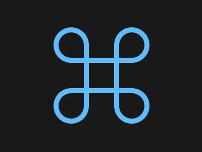
Solution:
<div></div>
<style>
  body {
    background: #191919;
    display: grid;
    place-items: center;
    margin: 0;
  }
  div {
    width: 50px;
    height: 50px;
    border: solid 10px #5dbcf9;
  }
  div::before,
  div::after,
  body::before,
  body::after {
    position: absolute;
    content: "";
    width: 50px;
    height: 50px;
    border: solid 10px #5dbcf9;
    top: 0;
    left: 0;
    border-radius: 50%;
    border-bottom-right-radius: 0px;
    top: 55px;
    left: 105px;
  }
  div::after {
    transform: rotate(90deg);
    left: 225px;
  }
  body::before,
  body::after {
    top: 175px;
    transform: rotate(270deg);
  }
  body::after {
    left: 225px;
    transform: rotate(180deg);
  }
</style>
Minified:
<h1><p><p a><p b><p c><style>*{width:50;height:50;background:#191919;border:solid 11q#5DBCF9}h1{margin:86 138;outline:solid 50vw#191919}p{position:fixed;top:22;left:106;border-radius:50%50%0}[a]{left:226;scale:-1 1}[b]{top:142;scale:1-1}[c]{top:142;left:226;scale:-1-1
Door Knob
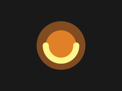
Solution:
<div></div>
<style>
  body {
    background: radial-gradient(
        circle at 150px 50%,
        #fff58f 10px,
        transparent 10px
      ), radial-gradient(circle at 250px 50%, #fff58f 10px, transparent 10px),
      radial-gradient(circle, #e08027 50px, #824b20 50px, #824b20 80px, #191919
          80px);
    display: grid;
    place-items: center;
  }
  div {
    width: 80px;
    height: 80px;
    border: solid 20px #fff58f;
    border-top-color: transparent;
    border-left-color: transparent;
    border-radius: 50%;
    transform: rotate(45deg);
  }
</style>
Minified:
<p><style>body{background:radial-gradient(circle at 50vh 50%,#FFF58F 10px,#00000000 0),radial-gradient(circle at 265q 50%,#FFF58F 10px,#00000000 0),radial-gradient(circle,#E08027 53q,#824B20 0 5em,#191919 5em)}p{width:80;height:80;
border:solid 20px;border-color:#00000000#FFF58F#FFF58F#00000000;border-radius:50%;rotate:45deg;margin:90 132
Max Volume

Solution:
<div></div>
<style>
  body {
    background: linear-gradient(to right, #191919 225px, transparent 225px),
      radial-gradient(circle at 225px 50%, #191919 40px, #5dbcf9 40px, #5dbcf9
          50px, #191919 50px, #191919 65px, #5dbcf9 65px, #5dbcf9 75px, #191919
          75px, #191919 90px, #5dbcf9 90px, #5dbcf9 100px, #191919 100px);
  }
  div {
    width: 0px;
    height: 0px;
    border: solid 100px transparent;
    border-right-color: #5dbcf9;
    margin: 50px -8px;
  }
  div::after {
    position: absolute;
    content: "";
    background: #5dbcf9;
    width: 50px;
    height: 50px;
    left: 75px;
    top: 125px;
    border-radius: 8px 0 0 8px;
  }
</style>
Minified:
<p><h1 a><h1 b><style>&{background:#191919}p{width:60;height:50;background:#5DBCF9;margin:125 67;border-radius:10px}h1{width:100;height:200;background:#5DBCF9;margin:-250 92}[a]{clip-path:polygon(0 50%,100%0,100%100%)}[b]{margin:50 217;border-radius:0 25vw 25vw 0;background:radial-gradient(circle at 0 50%,#191919 42q,#5DBCF9 0 53q,#191919 0 69q,#5DBCF9 0 79q,#191919 0 95q,#5DBCF9 0 25vw,#191919 0
Batmicky
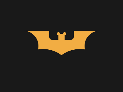
Solution:
<div></div>
<style>
  body {
    background: #191919;
    display: grid;
    place-items: center;
  }
  div {
    width: 240px;
    height: 100px;
    background: #f2ad43;
    position: relative;
  }
  div::before,
  div::after {
    position: absolute;
    content: "";
    background: #191919;
    width: 80px;
    height: 30px;
    top: 0px;
    left: 80px;
    border-radius: 0 0 10px 10px;
  }
  div::after {
    background: #f2ad43;
    width: 20px;
    height: 20px;
    border-radius: 0px;
    left: 110px;
    top: 10px;
  }
  body::before {
    position: absolute;
    content: "";
    background: #f2ad43;
    width: 10px;
    height: 10px;
    border-radius: 50%;
    top: 105px;
    left: 185px;
    z-index: 1;
    box-shadow: 20px 0 0 0 #f2ad43, 140px 43px 0 50px #191919,
      -120px 43px 0 50px #191919, -45px 125px 0 70px #191919,
      60px 125px 0 70px #191919;
  }
</style>
Minified:
TBD
Video Reel
Solution:
<div></div>
<style>
  body {
    background: #5dbcf9;
    margin: 0;
  }
  div {
    width: 140px;
    height: 110px;
    background: #191919;
    position: relative;
    top: 70px;
    left: 55px;
    box-shadow: 0 150px 0 0 #191919, 0 -150px 0 0 #191919,
      300px 150px 0 0 #191919, 300px 0px 0 0 #191919, 300px -150px 0 0 #191919, 150px
        200px 0 0 #191919, 150px 50px 0 0 #191919, 150px -100px 0 0 #191919,
      -150px 200px 0 0 #191919, -150px 50px 0 0 #191919,
      -150px -100px 0 0 #191919;
  }
</style>
Minified:
<body bgcolor=5DBCF9><p><style>p{width:140;height:110;background:#191919;margin:-38-103;color:191919;box-shadow:0 50vh,0 75vw,50vh -53q,50vh 25vw,50vh 265q,75vw 0,75vw 50vh,75vw 75vw,476q -53q,476q 25vw,476q 265q;
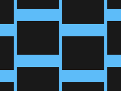
Bell

Solution:
<div></div>
<style>
  body {
    display: grid;
    place-items: center;
    background: radial-gradient(
        circle at 50% 91px,
        #f2ad43 25px,
        transparent 25px
      ), radial-gradient(circle at 50% 210px, #824b20 25px, #191919 25px);
  }
  div {
    width: 120px;
    height: 120px;
    background: #e08027;
    border-radius: 60px 60px 8px 8px;
  }
</style>
Minified:
<p><style>&{background:radial-gradient(circle at 50% 30vh,#F2AD43 26q,#00000000 0),radial-gradient(circle at 50% 70vh,#824B20 26q,#191919 0)}p{width:120;height:120;background:#E08027;border-radius:5em 5em 15q 15q;margin:90 132