Overflow
Pastel Logo

Solution:
<div></div>
<style>
  body {
    background: radial-gradient(
      circle at 50% 125px,
      #4f77ff 75px,
      #19191a 75px
    );
  }
  div {
    width: 75px;
    height: 125px;
    background: #f9e492;
    margin: 125px 117px;
  }
  div::before {
    content: "";
    position: absolute;
    width: 75px;
    height: 75px;
    background: #9ad5ff;
    border-bottom-left-radius: 75px;
  }
</style>
Minified:
<p><style>body{background:radial-gradient(circle at 50% 125px,#4F77FF 75px,#19191A 0)}p{width:75;height:125;background:radial-gradient(circle at 75px 0,#9AD5FF 75px,#F9E492 0);margin:125 117
Black Lives Matter

Solution:
<div></div>
<style>
  body {
    background: #f9e492;
  }
  div {
    width: 50px;
    height: 80px;
    background: #191919;
    border-radius: 0 0 10px 10px;
    margin: 143px auto;
    position: relative;
    z-index: 1;
  }
  div::before,
  div::after {
    position: absolute;
    content: "";
    top: -5px;
    left: -25px;
    width: 100px;
    height: 40px;
    background: #191919;
    border-radius: 0 0 10px 10px;
  }
  div::after {
    width: 65px;
    height: 20px;
    border: solid 5px #f9e492;
    z-index: 1;
    border-radius: 20px;
    top: -16px;
    left: -45px;
    transform: rotate(-30deg);
  }
  body::before,
  body::after {
    position: absolute;
    content: "";
    top: 88px;
    left: 155px;
    width: 20px;
    height: 45px;
    background: #191919;
    border-radius: 12px;
  }
  body::before {
    box-shadow: 25px -10px 0 0 #191919, 50px 0 0 0 #191919;
  }
  body::after {
    width: 20px;
    height: 35px;
    left: 230px;
    top: 98px;
  }
</style>
Minified:
TBD
Windmill
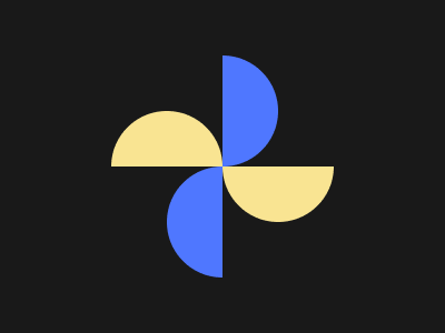
Solution:
<div></div>
<style>
  body {
    background: #191919;
  }
  body::before,
  body::after,
  div::before,
  div::after {
    content: "";
    position: absolute;
    width: 100px;
    height: 100px;
    background: #4f77ff;
    border-radius: 50%;
    left: 150px;
    top: 150px;
    clip-path: polygon(0 0, 50% 0, 50% 100%, 0 100%);
  }
  body::before {
    top: 50px;
    box-shadow: 50px 0 0 0 #191919;
    transform: rotate(180deg);
  }
  div::before,
  div::after {
    background: #f9e492;
    top: 100px;
    left: 100px;
    transform: rotate(90deg);
  }
  div::after {
    left: 200px;
    transform: rotate(270deg);
  }
</style>
Minified:
<body bgcolor=191919><p><p a e><p b c><p b c d e><style>p{width:100;height:50;background:#F9E492;border-radius:25vw 25vw 0 0;margin:26%92}[a]{margin:-26%192}[b]{background:#4F77FF}[c]{rotate:90deg;margin:-125 167}[d]{margin:46%117}[e]{scale:-1
Skull

Solution:
<div></div>
<style>
  body {
    background: #191919;
  }
  div {
    width: 120px;
    height: 100px;
    background: #4f77ff;
    margin: 85px auto;
    border-radius: 60px 60px 10px 10px;
    position: relative;
    z-index: 1;
  }
  div::before,
  div::after {
    position: absolute;
    background: #191919;
    content: "";
  }
  div::before {
    width: 20px;
    height: 20px;
    border-radius: 50%;
    bottom: -11px;
    left: 50px;
    box-shadow: 25px -28px 0 10px #191919, -25px -28px 0 10px #191919;
  }
  div::after {
    width: 10px;
    height: 20px;
    bottom: -40px;
    left: 55px;
    border-radius: 4px;
    box-shadow: 15px 0px 0 0 #191919, -15px 0px 0 0 #191919;
  }
  body::after {
    position: absolute;
    background: #4f77ff;
    content: "";
    width: 80px;
    height: 40px;
    left: 160px;
    bottom: 85px;
    border-radius: 0 0 20px 20px;
  }
</style>
Minified:
<p><p a><h1><h1 b><style>*{background:#191919;color:191919}p{
width:120;height:100;background:#4F77FF;margin:85 132;border-radius:63q 63q 11q 11q}[a]{width:80;height:50;border-radius:22q;margin:-105 152}h1{width:20;height:20;border-radius:50%;margin:66 182;box-shadow:26q -30q 0 11q,-26q -30q 0 11q}[b]{width:10;border-radius:4q;box-shadow:15q 0,-15q 0;margin:-57 187
Pillars
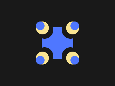
Solution:
<div>
  <div>
    <style>
      body {
        background: #191919;
        display: grid;
        place-items: center;
      }
      div {
        background: #4f77ff;
        width: 110px;
        height: 110px;
        position: relative;
      }
      div::after {
        position: absolute;
        content: "";
        width: 30px;
        height: 30px;
        border-radius: 50%;
        background: #4f77ff;
        top: -20px;
        left: -20px;
        box-shadow: 8px 8px 0 7px #f9e492, 14px 14px 0 16px #191919,
          120px 0px 0 0px #4f77ff, 112px 8px 0 7px #f9e492,
          106px 14px 0 16px #191919, 120px 120px 0 0px #4f77ff,
          112px 112px 0 7px #f9e492, 106px 106px 0 16px #191919,
          0px 120px 0 0px #4f77ff, 8px 112px 0 7px #f9e492,
          14px 106px 0 16px #191919;
      }
    </style>
  </div>
</div>
Minified:
TBD
Rose

Solution:
<div></div>
<p></p>
<style>
  body {
    background: #191919;
    margin: 0;
    position: relative;
  }
  body::before {
    content: "";
    position: absolute;
    width: 30px;
    height: 30px;
    background: transparent;
    border-radius: 50%;
    top: 40px;
    left: 185px;
    box-shadow: 0 60px 0 35px #4f77ff, 0 110px 0 5px #f9e492;
  }
  body::after {
    content: "";
    position: absolute;
    width: 20px;
    height: 90px;
    background: #f9e492;
    border-radius: 10px;
    top: 165px;
    left: 190px;
  }
  div {
    box-sizing: border-box;
    width: 160px;
    height: 50px;
    background: #4f77ff;
    position: relative;
    top: 75px;
    left: 120px;
    border: solid 10px #191919;
    border-radius: 100px 100px 200px 200px;
  }
  p {
    width: 30px;
    height: 30px;
    background: #4f77ff;
    position: relative;
    border-radius: 50%;
    z-index: 1;
    top: -30px;
    left: 175px;
    border: solid 10px #191919;
  }
  div::after {
    box-sizing: border-box;
    position: absolute;
    content: "";
    width: 120px;
    height: 50px;
    background: #4f77ff;
    top: -30px;
    left: 10px;
    border: solid 10px #191919;
    border-radius: 100px 100px 200px 200px;
  }
</style>
Minified:
<body bgcolor=191919><p a y><p b y><p c><p d><p e z><p f z><style>p{background:#4F77FF;height:30;color:191919;border-radius:50%}[y]{background:#F9E492}[z]{border:solid 11q}[a]{width:20;height:90;border-radius:11q;margin:43%182}[b]{width:40;height:40;margin:-275 172}[c]{width:100;height:50;border-radius:0 0 25vw 25vw;margin:205 142}[d]{width:140;margin:-285 122;border-radius:5q 5q 26q 26q;box-shadow:0 10q}[e]{width:100;margin:225 132;border-radius:15q 15q 37q 37q}[f]{width:30;margin:-77%167
Earth

Solution:
<div>
  <div>
    <style>
      body {
        background: linear-gradient(
            transparent 105px,
            #191919 105px,
            #191919 115px,
            transparent 115px,
            transparent 145px,
            #191919 145px,
            #191919 155px,
            transparent 155px,
            transparent 185px,
            #191919 185px,
            #191919 195px,
            transparent 155px
          ), linear-gradient(
            to right,
            transparent 195px,
            #191919 195px,
            #191919 205px,
            transparent 205px
          ), radial-gradient(
            circle at 265px 150px,
            transparent 100px,
            #191919 100px,
            #191919 110px,
            transparent 110px
          ), radial-gradient(
            circle at 135px 150px,
            transparent 100px,
            #191919 100px,
            #191919 110px,
            transparent 110px
          ), radial-gradient(circle, #4f77ff 75px, #191919 75px);
        display: grid;
        place-items: center;
      }
    </style>
  </div>
</div>
Minified:
<body bgcolor=191919><p a><p b><p b c><style>p{width:190;aspect-ratio:1;border-radius:50%}[a]{width:150;background:linear-gradient(90deg,#00000000 74q,#191919 0 5em,#00000000 0),repeating-linear-gradient(#4F77FF 0 32q,#191919 0 5ch);margin:75 117}[b]{margin:-255 27;border:solid 11q#191919}[c]{margin:45 147
Evil Triangles

Solution:
<div></div>
<style>
  body {
    background: #191919;
    display: grid;
    place-items: center;
  }
  div {
    width: 200px;
    height: 150px;
    background: #4f77ff;
    position: relative;
  }
  div::after,
  div::before {
    content: "";
    position: absolute;
    width: 50px;
    height: 50px;
    background: #191919;
    top: 25px;
    transform: skewY(45deg);
  }
  div::before {
    box-shadow: 0 100px 0 0 #191919, 100px 0px 0 0 #191919,
      100px -100px 0 0 #191919;
  }
  div::after {
    transform: skewY(-45deg);
    left: 50px;
    box-shadow: 0 100px 0 0 #191919, 100px 100px 0 0 #191919,
      100px 200px 0 0 #191919;
  }
</style>
Minified:
<p><h1><h1 a><style>*{background:#191919;color:191919}p{width:200;height:150;background:#4F77FF;margin:75 92}h1{width:50;height:50;transform:skewY(45deg);box-shadow:0 25vw,25vw 0,25vw -25vw;margin:-200 92}[a]{margin:39%142;scale:1-1;box-shadow:0 -25vw,25vw -25vw,25vw -50vw