Backface
Birdie
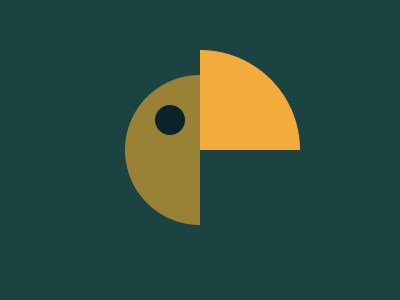
Solution:
<div></div>
<style>
  body {
    background: #1a4341;
    display: grid;
    place-items: center;
  }
  div {
    width: 150px;
    height: 150px;
    background: #998235;
    border-radius: 50%;
    position: relative;
  }
  div::before {
    content: "";
    position: absolute;
    width: 30px;
    height: 30px;
    border-radius: 50%;
    background: #0b2429;
    top: 30px;
    left: 30px;
  }
  div::after {
    content: "";
    position: absolute;
    width: 100px;
    height: 100px;
    border-top-right-radius: 100%;
    background: #f3ac3c;
    right: -25px;
    top: -25px;
    box-shadow: 10px 80px 0 10px #1a4341;
  }
</style>
Minified:
<body bgcolor=1A4341><p><h1><style>p{width:75;height:150;background:radial-gradient(circle at 48q 48q,#0B2429 16q,#998235 0);border-radius:5em 0 0 5em;margin:75 117}h1{width:100;height:100;background:#F3AC3C;margin:-250 192;border-radius:0 100%0 0
Christmas Tree
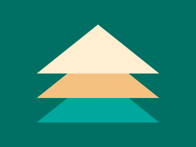
Solution:
<div class="stack">
  <div class="tree"></div>
</div>
<style>
  body {
    background: #007065;
    display: grid;
    place-items: center;
  }
  .stack {
    transform: translateY(-50px) rotateX(37deg);
  }
  .tree,
  .tree::before,
  .tree::after {
    width: 0px;
    height: 0px;
    border: solid 125px transparent;
    border-bottom-color: #f5c181;
    position: relative;
  }
  .tree::before {
    content: "";
    position: absolute;
    border-bottom-color: #ffeecf;
    left: -125px;
    top: -188px;
    z-index: 1;
  }
  .tree::after {
    content: "";
    position: absolute;
    border-bottom-color: #00a79d;
    left: -125px;
    top: -62px;
    z-index: -1;
  }
</style>
Minified:
<body bgcolor=007065><p><p a><p b><style>p{width:250;height:100;background:#00A79D;margin:39%67;clip-path:polygon(50%0,100%100%,0%100%)}[a]{background:#F5C181;margin:-78%67}
[b]{background:#FFEECF
Ice Cream

Solution:
<div class="icecream"></div>
<style>
  body {
    background: #293462;
  }
  .icecream {
    width: 100px;
    height: 150px;
    border-radius: 50px 50px 20px 20px;
    background: #fff1c1;
    margin: 50px auto;
    position: relative;
  }
  .icecream::before {
    content: "";
    position: absolute;
    height: 10px;
    width: 30px;
    background: #a64942;
    bottom: -10px;
    left: 35px;
  }
  .icecream::after {
    content: "";
    position: absolute;
    height: 40px;
    width: 30px;
    background: #fe5f55;
    bottom: -50px;
    left: 35px;
    border-radius: 0 0 10px 10px;
  }
</style>
Minified:
<body bgcolor=293462><p><h1>
<style>p{width:100;height:150;border-radius:54q 54q 22q 22q;background:#FFF1C1;margin:50 142 0}h1{width:30;height:50;background:linear-gradient(#A64942 10px,#FE5F55 0);border-radius:0 0 11q 11q;margin:0 177
Interleaved

Solution:
<div class="branch"></div>
<style>
  body {
    background: #1a4341;
    margin: 0;
  }
  .branch {
    width: 50px;
    height: 200px;
    border-radius: 50px 50px 0px 0px;
    background: #f3ac3c;
    box-shadow: 150px 0 0 0 #f3ac3c, 300px 0 0 0 #f3ac3c;
    position: absolute;
    bottom: 0px;
    left: 25px;
  }
  .branch::before,
  .branch::after {
    content: "";
    position: absolute;
    width: 50px;
    height: 200px;
    background: #998235;
    top: -50%;
    border-radius: 0 0 50px 50px;
    left: 75px;
  }
  .branch::after {
    left: 225px;
  }
</style>
Minified:
<body bgcolor=1A4341><p><style>p{width:50;height:250;border-radius:4em;background:#F3AC3C;color:F3AC3C;margin:26%17;box-shadow:50vh 0,75vw 0,79q -50vh#998235,75vh -50vh#998235
Tunnel
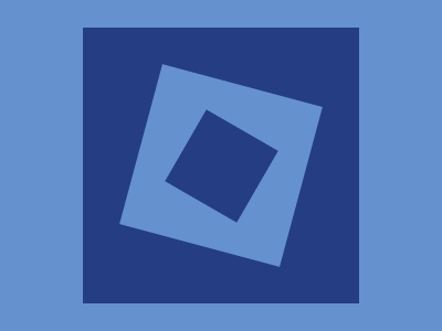
Solution:
<div class="tunnel"></div>
<style>
  body {
    background: #6592cf;
    display: grid;
    place-items: center;
  }
  .tunnel {
    width: 250px;
    height: 250px;
    background: #243d83;
    position: relative;
  }
  .tunnel::before,
  .tunnel::after {
    content: "";
    position: absolute;
    width: 150px;
    height: 150px;
    background: #6592cf;
    top: 50px;
    left: 50px;
    transform: rotate(15deg);
  }
  .tunnel::after {
    left: 225px;
    width: 75px;
    height: 75px;
    background: #243d83;
    top: 88px;
    left: 88px;
    transform: rotate(30deg);
  }
</style>
Minified:
<p c><p b><p a><style>p{width:75;aspect-ratio:1;position:fixed;background:#243D83}[a]{top:97;left:163;rotate:30deg}[b]{width:150;rotate:15deg;background:#6592CF;rotate:15deg;top:59;left:125}[c]{width:250;top:9;left:75;box-shadow:0 0 0 25vw#6592CF
Not Simply Square
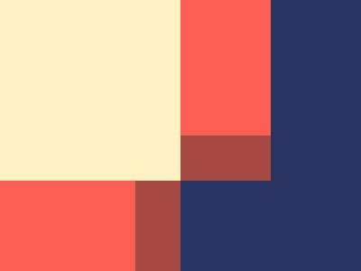
Solution:
<style>
  body {
    margin: 0;
    background: linear-gradient(
      to right,
      #fff1c1 200px,
      #fe5f55 200px,
      #fe5f55 300px,
      #293462 300px
    );
  }
  body::before {
    position: absolute;
    content: "";
    width: 100%;
    height: 100px;
    background: linear-gradient(
      to right,
      #fe5f55 150px,
      #a64942 150px,
      #a64942 200px,
      #293462 200px
    );
    bottom: 0;
  }
  body::after {
    position: absolute;
    content: "";
    width: 100px;
    height: 50px;
    background: #a64942;
    top: 50%;
    left: 50%;
  }
</style>
Minified:
<h1><p><p a><style>*{background:#293462;margin:0}h1{width:200;height:200;background:#FFF1C1}p{width:200;height:100;background:linear-gradient(90deg,#FE5F55 75%,#A64942 0);position:fixed;top:200}[a]{rotate:90deg;top:50;left:150
Sunset
Solution:
<style>
  body {
    background: radial-gradient(circle at 50% 50%, #998235 100px, #1a4341 50px);
  }
  body::before {
    position: absolute;
    content: "";
    width: 250px;
    height: 250px;
    border-radius: 50%;
    background: linear-gradient(
      transparent 55px,
      #1a4341 55px,
      #1a4341 75px,
      #f3ac3c 75px,
      #f3ac3c 95px,
      #1a4341 95px,
      #1a4341 115px,
      #f3ac3c 115px,
      #f3ac3c 135px,
      #1a4341 135px,
      #1a4341 155px,
      #f3ac3c 155px,
      #f3ac3c 175px,
      #1a4341 175px,
      #1a4341 195px,
      transparent 195px
    );
    top: 50%;
    left: 50%;
    transform: translate(-50%, -50%);
  }
</style>
Minified:
TBD
Letter B

Solution:
<style>
  body {
    background: radial-gradient(
      circle at 50% 50%,
      #6592cf 50px,
      #243d83 50px,
      #243d83 100px,
      #6592cf 100px
    );
  }
  body::before {
    position: absolute;
    content: "";
    background: linear-gradient(to right, #243d83 50px, #6592cf 50px);
    width: 100px;
    height: 110px;
    left: 100px;
    top: 50px;
  }
</style>
Minified:
<style>*>*{background:radial-gradient(circle,#6592CF 50px,#243D83 0,#243D83 25vw,#6592CF 0)}*>*::after{position:fixed;content:"";background:linear-gradient(90deg,#243D83 50px,#6592CF 0);width:100;height:110;left:100;top:50
Fox Head

Solution:
<div class="fox left"></div>
<div class="fox right"></div>
<style>
  body {
    background: #293462;
    display: flex;
    justify-content: center;
    padding-top: 72px;
  }
  .fox {
    background: #fe5f55;
    width: 50px;
    height: 140px;
    position: relative;
  }
  .left {
    border-top-right-radius: 40px;
  }
  .fox::before {
    content: "";
    position: absolute;
    width: 30px;
    height: 30px;
    border-radius: 50%;
    top: 60px;
    background: #293462;
    left: 15px;
  }
  .fox::after {
    content: "";
    position: absolute;
    width: 50px;
    height: 40px;
    background: #293462;
    bottom: 0;
    border-top-right-radius: 50px;
  }
  .right::after {
    border-top-right-radius: 0px;
    border-top-left-radius: 50px;
  }
  .right {
    border-top-left-radius: 40px;
  }
  .right::before {
    left: 5px;
  }
</style>
Minified:
<p><p a><style>&{background:radial-gradient(circle at 50%70%,#FE5F55 50q,#293462 0)}p{width:50;height:100;background:radial-gradient(circle at 60%75%,#293462 16q, #FE5F55 0);margin:80 142;border-radius:0 5ch 0 0;box-shadow:0 25vw#293462}[a]{margin:-47%192;scale:-1 1