Display
SitePoint Logo

Solution:
<div class="yellow one">
  <div class="yellow leg">
    <div class="blue one">
      <div class="blue leg">
        <style>
          body {
            background: #222;
            position: relative;
            margin: 0;
            transform: rotateZ(-45deg);
            transform-origin: 38% 29%;
          }
          div {
            width: 100px;
            height: 30px;
            position: absolute;
          }
          .yellow {
            background: #f2994a;
          }
          .one {
            top: 100px;
            left: 100px;
            border-top-left-radius: 10px;
          }
          .leg {
            width: 30px;
            height: 80px;
            border-top-left-radius: 10px;
            border-bottom-right-radius: 6px;
          }
          .blue {
            background: #2d9cdb;
            top: 100px;
            left: -18px;
          }
          .blue.one {
            transform: rotateY(180deg) rotateX(180deg);
          }
          .blue.leg {
            background: #2d9cdb;
            top: 0px;
            left: 0px;
            transform: rotateX(0deg);
          }
        </style>
      </div>
    </div>
  </div>
</div>
Minified:
<p><p a b e><p c e><p b c d><style>&{background:#222;rotate:-45deg}p{width:100;height:30;background:#F2994A;position:fixed;top:68;left:159;border-radius:10q 0 0}[a]{margin:-17 130;top:201;left:11}[b]{background:#2D9CDB}[e]{scale:-1}[c]{width:65;rotate:90deg;border-radius:0 10q 0 5q;top:101;left:141}[d]{top:135;left:193
Cloud

Solution:
<div></div>
<style>
  body {
    background: #f5d6b4;
  }
  div {
    width: 175px;
    height: 50px;
    background: #d86f45;
    border-radius: 30px;
    position: relative;
    top: 157px;
    left: 117px;
  }
  div::before,
  div::after {
    position: absolute;
    width: 100px;
    height: 100px;
    border-radius: 50%;
    background: #d86f45;
    content: "";
    top: -100%;
    left: -25px;
  }
  div::after {
    position: after;
    left: 55px;
    top: -80;
  }
</style>
Minified:
<body bgcolor=F5D6B4><p><h1><style>p{width:175;height:50;background:#D86F45;border-radius:2em;margin:43%117}h1{width:100;height:100;border-radius:50%;background:#D86F45;margin:-69%92;box-shadow:5ch -32q#D86F45
Boxception

Solution:
<div></div>
<style>
  body {
    background: #f3ac3c;
    display: grid;
    place-items: center;
  }
  div {
    width: 200px;
    height: 200px;
    background: #1a4341;
    position: relative;
  }
  div::before {
    position: absolute;
    content: "";
    background: #998235;
    width: 100px;
    height: 100px;
    bottom: 0;
  }
  div::after {
    position: absolute;
    content: "";
    background: #f3ac3c;
    width: 50px;
    height: 50px;
    bottom: 0;
    left: 25%;
  }
</style>
Minified:
<body bgcolor=F3AC3C><p><style>p{width:50;height:50;background:#F3AC3C;margin:200 142;box-shadow:-25px -25px 0 25px#998235,25px -75px 0 75px#1A4341
Switches
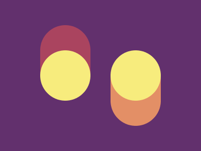
Solution:
<div></div>
<div></div>
<style>
  body {
    background: #62306d;
    display: flex;
    align-items: center;
    justify-content: center;
    gap: 40px;
  }
  div {
    width: 100px;
    height: 100px;
    background: #f7ec7d;
    border-radius: 50%;
    position: relative;
  }
  div::before {
    content: "";
    position: absolute;
    width: 100px;
    height: 100px;
    background: #aa445f;
    border-radius: 50px 50px 0 0;
    z-index: -1;
    top: -50px;
  }
  div:nth-child(2)::before {
    content: "";
    position: absolute;
    width: 100px;
    height: 100px;
    background: #e38f66;
    border-radius: 0 0 50px 50px;
    top: 50px;
  }
</style>
Minified:
<body bgcolor=62306D><p><p a><style>p{width:100;height:150;background:radial-gradient(100q at 50%25vw,#F7EC7D 50px,#AA445F 0);margin:50 72;border-radius:4em;}[a]{
margin:-39%212;background:radial-gradient(100q at 50%33%,#F7EC7D 50px,#E38F66 0
Blossom

Solution:
<div></div>
<div></div>
<style>
  body {
    background: #998235;
  }
  div {
    width: 80px;
    height: 100px;
    background: #1a4341;
    border-radius: 0 50px 0 50px;
    position: relative;
    top: 52px;
    left: 102px;
  }
  div:nth-child(2) {
    transform: rotateY(180deg);
    left: 202px;
    top: 32px;
  }
  div::before {
    content: "";
    position: absolute;
    width: 80px;
    height: 60px;
    background: #f3ac3c;
    border-radius: 0 50px 0 50px;
    top: 120px;
  }
  div:nth-child(2)::before {
    top: -80px;
  }
</style>
Minified:
<body bgcolor=998235><p><p a><p c><p a c d><style>p{width:80;height:100;background:#1A4341;border-radius:0 52q;margin:60 102}[a]{scale:1-1;margin:-80 202}[c]{height:60;background:#F3AC3C;margin:20 102}[d]{margin:-52%202
Smiley
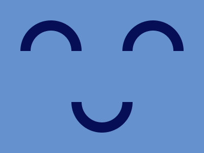
Solution:
<style>
  body {
    background: linear-gradient(
        transparent 100px,
        #6592cf 100px,
        #6592cf 200px,
        transparent 150px
      ), radial-gradient(
        circle at 300px 100px,
        #6592cf 40px,
        #060f55 40px,
        #060f55 60px,
        transparent 60px
      ), radial-gradient(
        circle at 50% 200px,
        #6592cf 40px,
        #060f55 40px,
        #060f55 60px,
        transparent 60px
      ), radial-gradient(circle at 100px 100px, #6592cf 40px, #060f55 40px, #060f55
          60px, #6592cf 60px);
  }
</style>
Minified:
<body bgcolor=6592CF><p><p a><p b><style>p{border:solid 20px#060F55;width:80;height:40;border-bottom:none;border-radius:5em 5em 0 0;margin:40 32}p[a]{margin:-26%232}p[b]{margin:52%132;scale:-1
Lock Up
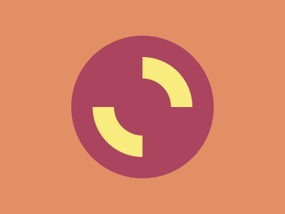
Solution:
<div></div>
<style>
  body {
    background: #e38f66;
    display: grid;
    place-items: center;
  }
  div {
    width: 200px;
    height: 200px;
    border-radius: 50%;
    background: radial-gradient(
      #aa445f 0px,
      #aa445f 40px,
      #f7ec7d 40px,
      #f7ec7d 70px,
      #aa445f 70px
    );
  }
  div::before,
  div::after {
    content: "";
    position: absolute;
    width: 100px;
    height: 100px;
    background: #aa445f;
    top: 50px;
    border-top-left-radius: 100%;
  }
  div::after {
    top: 150px;
    left: 200px;
    border-radius: 0;
    border-bottom-right-radius: 100%;
  }
</style>
Minified:
<p><style>body{background:radial-gradient(circle,#AA445F 25vw,#E38F66 0)}p{width:80;height:80;border-radius:50%;border:solid 30px;border-color:#F7EC7D#AA445F;margin:80 122;rotate:45deg
Cups & Balls
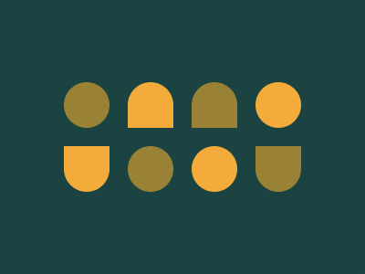
Solution:
<div></div>
<div class="yel pie"></div>
<div class="pie"></div>
<div class="yel"></div>
<div class="yel pie inv"></div>
<div></div>
<div class="yel"></div>
<div class="pie inv"></div>
<style>
  body {
    padding: 82px 62px;
    background: #1a4341;
    display: flex;
    flex-wrap: wrap;
    gap: 20px;
  }
  div {
    width: 50px;
    height: 50px;
    background: #998235;
    border-radius: 50%;
  }
  .yel {
    background: #f3ac3c;
  }
  .pie {
    border-radius: 50% 50% 0 0;
  }
  .inv {
    transform: rotateX(180deg);
  }
</style>
Minified:
<p><p a><p a b><style>*{background:#1A4341;color:F3AC3C}p{width:50;height:50;border-radius:50%;margin:90 62;background:#998235;box-shadow:74q 74q#998235,148q 74q,222q 0}[a]{border-radius:0 0 50%50%;margin:-70 272;box-shadow:-70vh 0}[b]{margin:-120 202;scale:-1;box-shadow:74q 0