Cursor
Cube

Solution:
<div class="square one"></div>
<div class="square two"></div>
<div class="square three"></div>
<style>
  body {
    background: #0b2429;
    position: relative;
    margin: 0;
  }
  .square {
    width: 100px;
    height: 100px;
    position: absolute;
  }
  .one {
    background: #f3ac3c;
    top: 135px;
    left: 150px;
    transform: rotate(45deg);
  }
  .two {
    width: 70px;
    height: 70px;
    background: #998235;
    top: 80px;
    left: 130px;
    transform: skew(0deg, -45deg);
  }
  .three {
    background: #1a4341;
    width: 70px;
    height: 70px;
    top: 80px;
    left: 200px;
    transform: skew(0deg, 45deg);
  }
</style>
Minified:
<body bgcolor=#0B2429><p><h1><h1 a><style>p{width:100;height:100;background:#F3AC3C;margin:135 142;rotate:45deg}h1{width:70;height:70;background:#998235;margin:-290 122;transform:skewY(-45deg)}[a]{background:#1A4341;margin:219 192;scale:1-1
Ticket
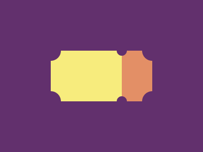
Solution:
<div class="yellow"></div>
<div class="peach"></div>
<style>
  body {
    background: #62306d;
    display: flex;
    justify-content: center;
    align-items: center;
    position: relative;
  }
  body::before,
  body::after {
    width: 20px;
    height: 20px;
    background: red;
    position: absolute;
    content: "";
    border-radius: 50%;
    left: 222px;
    top: 82px;
    z-index: 1;
    background: #62306d;
  }
  body::after {
    top: 182px;
  }
  .yellow {
    width: 140px;
    height: 100px;
    background: #f7ec7d;
    position: relative;
  }
  .yellow::before,
  .yellow::after,
  .peach::before,
  .peach::after {
    content: "";
    position: absolute;
    background: red;
    width: 40px;
    height: 40px;
    border-radius: 50%;
    top: -20px;
    left: -20px;
    background: #62306d;
  }
  .yellow::after {
    top: 80px;
  }
  .peach::before {
    top: -20px;
    left: 40px;
  }
  .peach::after {
    top: 80px;
    left: 40px;
  }
  .peach {
    width: 60px;
    height: 100px;
    background: #e38f66;
    position: relative;
  }
</style>
Minified:
<body bgcolor=62306D><p><h1><style>p{width:200;height:100;background:linear-gradient(90deg,#F7EC7D 35vw,#E38F66 0);margin:26%92}h1{width:20;height:20;background:#62306D;color:62306D;margin:-210 222;border-radius:50%;box-shadow:0 25vw,-35vw 0 0 11q,-35vw 25vw 0 10q,63q 0 0 11q,63q 25vw 0 11q