Visibility
Totally Triangle

Solution:
<div class="triangle"></div>
<style>
  * {
    margin: 0;
  }
  html {
    background: #0b2429;
  }
  body {
    background: #f3ac3c;
    clip-path: polygon(0 0, 140px 0, 0 140px);
  }
</style>
Minified:
<style>body{background:linear-gradient(135deg,#F3AC3C 25vw,#0B2429 0
Web Maker Logo

Solution:
<div class="elem">
  <div class="triangle"></div>
</div>
<div class="elem">
  <div class="triangle"></div>
</div>
<style>
  html {
    background: #f2f2b6;
  }
  .elem {
    position: relative;
    top: 77px;
    left: 20px;
  }
  .triangle {
    width: 150px;
    height: 150px;
    background: #ff6d00;
    clip-path: polygon(0 0, 150px 0, 75px 130px);
    position: absolute;
    z-index: 1;
    left: 2rem;
  }
  .elem::after {
    position: absolute;
    content: "";
    width: 150px;
    height: 150px;
    background: #fd4602;
    clip-path: polygon(0 0, 150px 0, 75px 130px);
    left: 13.5%;
  }
  .elem:nth-child(2) {
    position: relative;
    top: 77px;
    left: 150px;
    transform: rotate(180deg);
    transform-origin: 107px 65px;
  }
  .elem:nth-child(2) .triangle {
    z-index: -1;
  }
</style>
Minified:
<body bgcolor=F2F2B6><p a d><p><p b e><p c d e><style>p{width:150;height:130;background:#FF6D00;clip-path:polygon(0 0,100%0,50%100%);position:fixed;top:69;left:60}[a]{left:80}[b]{left:190}[c]{left:170}[d]{background:#FD4602}[e]{scale:-1
Overlap
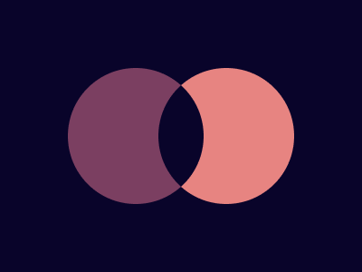
Solution:
<div class="circle"></div>
<div class="circle"></div>
<style>
  html {
    background: #09042a;
    position: relative;
  }
  .circle {
    width: 150px;
    height: 150px;
    border-radius: 50%;
    background: #7b3f61;
    position: absolute;
    top: 50%;
    transform: translateY(-50%);
    left: 75px;
  }
  .circle:nth-child(2) {
    background: #e78481;
    left: 175px;
    z-index: 1;
  }
  .circle:nth-child(2)::after {
    content: "";
    position: absolute;
    width: 80px;
    height: 80px;
    background: #09042a;
    z-index: 2;
    border-radius: 0% 96% 0% 96%;
    left: -15px;
    top: 35px;
    transform: rotate(45deg);
  }
</style>
Minified:
<body bgcolor=#09042A><p><p a><h1><style>p{width:150;height:150;border-radius:50%;background:#7B3F61;margin:75 67}[a]{background:#E78481;margin:-225 167}h1{width:80;height:80;background:#09042A;border-radius:0%96%0%96%;margin:110 152;rotate:45deg
Eye of the Tiger

Solution:
<div class="box">
  <div class="circle"></div>
</div>
<style>
  body {
    background: #0b2429;
    display: grid;
    place-items: center;
    position: relative;
  }
  .box {
    background: #998235;
    width: 200px;
    height: 200px;
    border-radius: 0 50% 0 50%;
    transform: rotate(-45deg);
  }
  .circle {
    width: 200px;
    height: 200px;
    position: absolute;
    top: 0%;
    left: 0%;
    background: radial-gradient(
      #0b2429 0px,
      #0b2429 25px,
      #f3ac3c 25px,
      #f3ac3c 70px,
      #0b2429 70px,
      #0b2429 90px,
      transparent 50px,
      transparent 60px
    );
    border-radius: 50%;
  }
</style>
Minified:
<body bgcolor=#0B2429><p><h1><style>p{background:#998235;width:200;height:200;border-radius:0 50%0 50%;rotate:-45deg;margin:50 92}h1{width:50;height:50;position:fixed;background:#0B2429;top:58.5;left:130;border-radius:50%;border:solid 48q#F3AC3C;outline:solid 20px#0B2429
Fidget Spinner
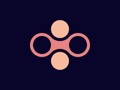
Solution:
<div class="bar"></div>
<div class="circle top light"></div>
<div class="circle left dark"></div>
<div class="circle bottom light"></div>
<div class="circle right dark"></div>
<style>
  body {
    background: #09042a;
    display: grid;
    place-items: center;
    position: relative;
  }
  .bar {
    background: #e78481;
    width: 160px;
    height: 55px;
  }
  .circle {
    width: 60px;
    height: 60px;
    position: absolute;
    border-radius: 50%;
  }
  .light {
    background: #f5bb9c;
    border: solid 10px #09042a;
  }
  .dark {
    background: #09042a;
    border: solid 10px #e78481;
  }
  .top {
    top: 49px;
  }
  .left {
    left: 92px;
  }
  .bottom {
    bottom: 49px;
  }
  .right {
    right: 92px;
  }
</style>
Minified:
<body bgcolor=09042A><p a><p><p b><p c><p c d><style>p{width:60;height:60;background:#09042A;color:E78481;border-radius:50q;border:solid 11q;position:fixed;top:94;left:100;}[a]{margin:15 60;background:#E78481}[b]{left:220}[c]{top:41;left:160;background:#F5BB9C;color:09042A}[d]{top:147
Matrix
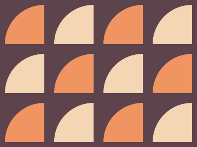
Solution:
<div class="slice"></div>
<div class="slice"></div>
<div class="slice"></div>
<div class="slice"></div>
<div class="slice"></div>
<div class="slice"></div>
<div class="slice"></div>
<div class="slice"></div>
<div class="slice"></div>
<div class="slice"></div>
<div class="slice"></div>
<div class="slice"></div>
<style>
  body {
    background: #5c434c;
    margin: 0;
    display: flex;
    flex-wrap: wrap;
    gap: 20px;
    padding: 10px;
  }
  .slice {
    width: 80px;
    height: 80px;
    background: #f5d6b4;
    border-top-left-radius: 100%;
  }
  .slice:nth-child(3n),
  .slice:nth-child(8n),
  .slice:nth-child(11n),
  .slice:nth-child(1) {
    background: #f09462;
  }
  .slice:nth-child(12n) {
    background: #f5d6b4;
  }
</style>
Minified:
<p><p a><p><p a><p a><p><p a><p><p><p a><p><p a>
<style>body{background:#5C434C;display:flex;flex-wrap:wrap;gap:21q;margin:10}p{width:80;height:80;background:#F09462;border-radius:100%0 0;margin:0}[a]{background:#F5D6B4