Pilot Battle
Simply Square
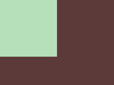
Solution:
<div class="box"></div>
<style>
  body {
    background: #5d3a3a;
    margin: 0;
  }
  .box {
    background: #b5e0ba;
    width: 200px;
    height: 200px;
  }
</style>
Minified:
<p><style>*{background:#5d3a3a;margin:0}p{background:#b5e0ba;width:200;height:200
Carrom

Solution:
<div class="box one"></div>
<div class="box two"></div>
<div class="box three"></div>
<div class="box four"></div>
<style>
  body {
    background: #62374e;
    display: flex;
    flex-wrap: wrap;
    padding: 42px;
    gap: 100px;
    justify-content: space-between;
  }
  .box {
    width: 50px;
    height: 50px;
    background: #fdc57b;
  }
</style>
Minified:
<body bgcolor=62374e><p><style>p{width:50;height:50;background:#fdc57b;margin:50 42;box-shadow:250px 0#fdc57b,0 50vh#fdc57b,250px 50vh#fdc57b
Push Button

Solution:
<div class="rectangle">
  <div class="circle"></div>
  <div class="circle2"></div>
</div>
<style>
  body {
    background: #6592cf;
    display: grid;
    place-items: center;
  }
  .rectangle {
    background: #243d83;
    width: 300px;
    height: 150px;
    display: grid;
    place-items: center;
  }
  .circle {
    width: 50px;
    height: 50px;
    background: #eeb850;
    border-radius: 50%;
    border: solid 50px #243d83;
    z-index: 1;
  }
  .circle2 {
    position: absolute;
    width: 50px;
    height: 50px;
    background: transparent;
    border-radius: 50%;
    border: solid 100px #6592cf;
  }
</style>
Minified:
<body bgcolor=#6592CF><p><h1><style>p{width:300;height:150;background:#243D83;margin:75 42}h1{width:50;height:50;background:#EEB850;border-radius:50%;border:solid 53q#243D83;outline:solid 53q#6592CF;margin:-225 117
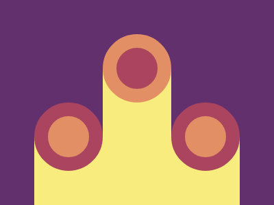
Ups n Downs
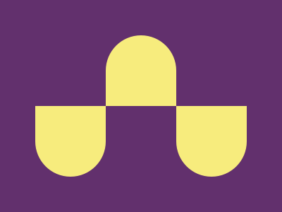
Solution:
<div class="pie"></div>
<div class="pie"></div>
<div class="pie"></div>
<style>
  body {
    background: #62306d;
    display: flex;
    position: relative;
  }
  .pie {
    background: #f7ec7d;
    width: 100px;
    height: 100px;
    border-radius: 0px 0px 50px 50px;
    position: absolute;
    top: 50%;
  }
  .pie:nth-child(1) {
    left: 42px;
  }
  .pie:nth-child(2) {
    left: 142px;
    border-radius: 50px 50px 0px 0px;
    top: 42px;
  }
  .pie:nth-child(3) {
    left: 242px;
  }
</style>
Minified:
<body bgcolor=62306D><p><p a><style>p{width:100;height:100;margin:50 142;background:#F7EC7D;border-radius:55q 55q 0 0}[a]{box-shadow:50vw 0#F7EC7D;scale:-1;margin:-50 242
Acid Rain
Solution:
<div class="pie"></div>
<div class="pie"></div>
<div class="pie"></div>
<style>
  body {
    background: #0b2429;
    display: flex;
    position: relative;
  }
  .pie {
    background: #f3ac3c;
    width: 120px;
    height: 120px;
    position: absolute;
    border-radius: 50% 0% 50% 50%;
  }
  .pie:nth-child(1) {
    top: 142px;
    left: 72px;
    z-index: 2;
  }
  .pie:nth-child(2) {
    background: #998235;
    left: 132px;
    top: 82px;
    z-index: 1;
  }
  .pie:nth-child(3) {
    left: 192px;
    top: 22px;
    border-radius: 50%;
  }
</style>
Minified:
<body bgcolor=#0B2429><p><p a c><p b c><style>p{width:120;height:120;background:#F3AC3C;border-radius:50%50%50%0;margin:30 192}[a]{margin:-90 132;background:#998235}[b]{margin:30 72}[c]{scale:-1
Missing Slice
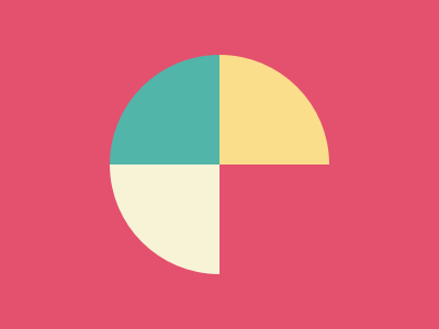
Solution:
<div class="box">
  <div class="part one"></div>
  <div class="part two"></div>
  <div class="part three"></div>
</div>
<style>
  body {
    background: #e3516e;
    display: grid;
    place-items: center;
  }
  .box {
    width: 200px;
    height: 200px;
    border-radius: 50%;
    display: flex;
    flex-wrap: wrap;
    overflow: hidden;
  }
  .part {
    width: 100px;
    height: 100px;
    background: #51b5a9;
  }
  .part:nth-child(2) {
    background: #fade8b;
  }
  .part:nth-child(3) {
    background: #f7f3d7;
  }
</style>
Minified:
<body bgcolor=E3516E><p><style>p{width:0;border:solid 25vw;border-color:51B5A9#FADE8B#E3516E#F7F3D7;border-radius:50%;rotate:-45deg;margin:13%92
Leafy Trail

Solution:
<div class="leaf"></div>
<div class="leaf"></div>
<div class="leaf"></div>

<style>
  body {
    background: #0b2429;
    position: relative;
  }
  .leaf {
    width: 150px;
    height: 150px;
    background: #1a4341;
    border-radius: 69% 0 69% 0;
    position: absolute;
    top: 50%;
    transform: translateY(-50%);
    left: 70px;
  }
  .leaf:nth-child(2) {
    background: #998235;
    left: 115px;
    z-index: 1;
  }
  .leaf:nth-child(3) {
    background: #f3ac3c;
    left: 165px;
    z-index: 2;
  }
</style>
Minified:
<body bgcolor=0B2429><p><p a><p b><style>p{width:150;height:150;background:#1A4341;margin:75 67;border-radius:25vw 0}p[a]{margin:-225 117;background:#998235}p[b]{margin:75 167;background:#F3AC3C
Forking Crazy
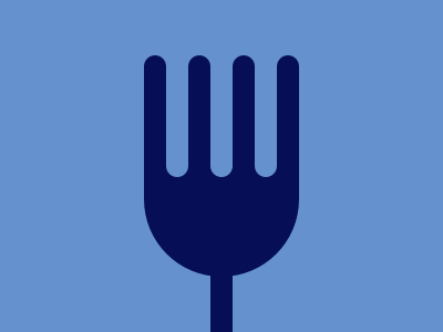
Solution:
<div class="stem"></div>
<div class="prong">
  <div class="p"></div>
  <div class="p"></div>
  <div class="p"></div>
  <div class="p"></div>
  <div class="p"></div>
  <div class="p"></div>
  <div class="p"></div>
</div>
<div class="base"></div>
<style>
  body {
    background: #6592cf;
    position: reltive;
  }
  body > div {
    background: #060f55;
    position: absolute;
    left: 50%;
    transform: translateX(-50%);
  }
  .base {
    width: 140px;
    height: 100px;
    border-radius: 0 0 68px 68px;
    bottom: 50px;
  }
  .stem {
    width: 20px;
    height: 52px;
    bottom: 0;
  }
  .prong {
    width: 140px;
    height: 110px;
    bottom: 140px;
    display: flex;
    z-index: 1;
    background: linear-gradient(#6592cf, #6592cf, #060f55, #060f55);
  }
  .p:nth-child(2n) {
    width: 20px;
    height: 110px;
    background: #6592cf;
    border-radius: 0 0 12px 12px;
  }
  .p:nth-child(2n + 1) {
    width: 20px;
    height: 150px;
    background: #060f55;
    border-radius: 10px;
    overflow: hidden;
  }
</style>
Minified:
<body bgcolor=#6592CF><p><h1><style>p{width:140;height:100;background:#060F55;margin:39%122;border-radius:0 0 74q 74q}h1{width:20;height:110;background:#6592CF;color:060F55;margin:-91%182;border-radius:10q;box-shadow:-42q 0#6592CF,42q 0#6592CF,0 50vh,-21q 0,21q 0,-63q 0,63q 0
Tesseract
Solution:
<div class="horizontal"></div>
<div class="center"></div>
<div class="circle"></div>
<style>
  body {
    background: #222730;
    position: relative;
    margin: 0;
  }
  div {
    background: #4caab3;
    position: absolute;
  }
  .horizontal {
    width: 100%;
    height: 150px;
    top: 75px;
  }
  .center {
    box-sizing: border-box;
    background: #4caab3;
    width: 250px;
    height: 250px;
    z-index: 1;
    top: 25px;
    left: 75px;
    transform: rotate(45deg);
    border: solid 50px #222730;
  }
  .circle {
    top: 50%;
    left: 50%;
    background: #393e46;
    width: 50px;
    height: 50px;
    z-index: 2;
    border-radius: 50%;
    transform: translate(-50%, -50%);
  }
</style>
Minified:
<p><p a><style>&{background:#222730}p{height:150;background:#4CAAB3;margin:75-8}p[a]{background:radial-gradient(#393E46 26q,#4CAAB3 0);width:150;rotate:45deg;margin:-275 67;border:solid 53q#222730
Cloaked Spirits
Solution:
<div class="yel"></div>
<div class="spirit one">
  <div class="disc"></div>
</div>
<div class="spirit two">
  <div class="disc alt"></div>
</div>
<div class="spirit three">
  <div class="disc"></div>
</div>
<style>
  body {
    background: #62306d;
    position: relative;
    margin: 0;
  }
  .yel {
    background: #f7ec7d;
    top: 100px;
    bottom: 0;
    position: absolute;
    left: 50px;
    right: 50px;
  }
  .spirit {
    width: 100px;
    height: 250px;
    position: absolute;
    z-index: 1;
    display: flex;
    flex-direction: column-reverse;
  }
  .spirit.one {
    background: #62306d;
    left: 50px;
    border-radius: 0 0 50px 50px;
    overflow: hidden;
  }
  .spirit.two {
    background: #f7ec7d;
    left: 150px;
    top: 50px;
    border-radius: 50px 50px 0 0;
    overflow: hidden;
    flex-direction: column;
  }
  .spirit.three {
    background: #62306d;
    left: 250px;
    border-radius: 0 0 50px 50px;
    overflow: hidden;
  }
  .disc {
    box-sizing: border-box;
    width: 100px;
    height: 100px;
    background: #e38f66;
    border: solid 20px #aa445f;
    border-radius: 50%;
  }
  .disc.alt {
    background: #aa445f;
    border: solid 20px #e38f66;
  }
</style>
Minified:
<body bgcolor=#62306D><h1><p><p a><p b><style>h1{width:100;height:250;background:#F7EC7D;color:F7EC7D;margin:51%42;box-shadow:25vw -25vw,50vw 0}p{width:60;height:60;border-radius:50%;color:AA445F;background:#E38F66;border:solid 20px;position:fixed;top:118}[a]{top:18;left:150;color:E38F66;background:#AA445F}[b]{left:250}
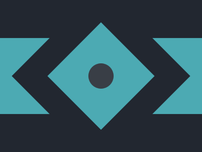
Eye of Sauron
Solution:
<div class="disc"></div>
<div class="half left"></div>
<div class="half right"></div>
<style>
  body {
    background: #191210;
    display: grid;
    place-items: center;
    position: relative;
  }
  .disc {
    background: radial-gradient(
      #84271c 0px,
      #84271c 25px,
      #191210 25px,
      #191210 50px,
      #eca03d 50px,
      #eca03d 70px,
      #191210 70px,
      #191210 70px
    );
    width: 150px;
    height: 150px;
  }
  .half {
    position: absolute;
    top: 0;
    left: 0;
    background: radial-gradient(
      transparent 0px,
      transparent 25px,
      #eca03d 25px,
      #eca03d 45px,
      transparent 45px
    );
    width: 110px;
    height: 110px;
    border-radius: 50%;
    clip-path: polygon(0 0, 100% 0, 100% 50%, 0 50%);
    top: 50%;
    transform: translateY(-50%);
    left: 232px;
  }
  .right {
    clip-path: polygon(0 100%, 0 50%, 100% 50%, 100% 100%);
    left: 42px;
  }
</style>
Minified:
<body bgcolor=191210><p><p a><p i><style>p{width:60;aspect-ratio:1;border-radius:50%;color:ECA03D;border:solid 20px;margin:26%42;clip-path:polygon(0 50%,100%50%,100%100%,0 100%)}[a]{width:50;margin:-52%142;clip-path:none;background:#84271C;border:solid 25px#191210;outline:solid 22q}[i]{margin:26%242;scale:-1
Wiggly Moustache
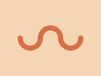
Solution:
<div class="disc"></div>
<div class="disc"></div>
<div class="disc"></div>
<style>
  body {
    background: #f5d6b4;
    position: relative;
    margin: 0;
  }
  * {
    box-sizing: border-box;
  }
  .disc {
    width: 100px;
    height: 100px;
    border-radius: 50%;
    clip-path: polygon(0 0, 100% 0, 100% 50%, 0 50%);
    border: solid 20px #d86f45;
    position: absolute;
    top: 50%;
    transform: translateY(-50%);
  }
  .disc:nth-child(1) {
    left: 70px;
    clip-path: polygon(0% 50%, 100% 50%, 100% 100%, 0% 100%);
  }
  .disc:nth-child(2) {
    left: 150px;
  }
  .disc:nth-child(3) {
    left: 230px;
    clip-path: polygon(0% 50%, 100% 50%, 100% 100%, 0% 100%);
  }
  body::after,
  body::before {
    content: "";
    width: 20px;
    height: 20px;
    background: #d86f45;
    position: absolute;
    border-radius: 50%;
    left: 70px;
    top: 50%;
    z-index: 1;
    transform: translateY(-50%);
  }
  body::before {
    left: 310px;
  }
</style>
Minified:
<body bgcolor=F5D6B4><p><p i><p j><h1><style>p{width:60;height:60;border-radius:50%;clip-path:polygon(0%50%,100%50%,100%100%,0%100%);border:solid 20px#D86F45;margin:26%62}[i]{margin:-200 142;scale:-1}[j]{margin:26%222}h1{width:20;height:20;border-radius:50%;background:#D86F45;margin:-160 62;box-shadow:60vw 0#D86F45